

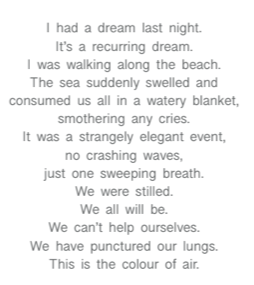
We stood still.
We all stood still.
Still stood still.
We're standing still.
Last week of March 2020
A whole new world has emerged this month shaped by the Covid-19 pandemic. Our lives have changed in a way that was unimaginable only weeks ago. It’s a strange time and with many generations having never lived in a restricted society, losing all the liberties we have naturally become accustomed to, it’s an exceptionally surreal experience. The life we knew a short while ago has stopped in its tracks and we literally have to live our lives online and in confinement.
I am currently in my final year of an MFA in Photography and it looks increasingly likely that we will have a completely digital hand in come May as the Universities are closing, along with all other “unnecessary” establishments. The positives to this, there always are positives, is that if you want to be creative you can do it anywhere and anyhow. I am ‘creating’ this blog to transfer my research/sketch/note book processes online in order that they can be assessed for the final module and to document further developments. (For information; it reads chronologically, so the latest workings will be at the end)
The majority of my third semester (September-December 2019) was spent in India. I applied for the exchange programme to an institute in India; Srishti Institute of Art & Design in Bangalore. Not being entirely certain about the direction of my final project, well I’ll be honest actually, I had very vague ideas but nothing conceptually binding before I left. I just took all my cameras, both digital and analogue and plenty of film and a free mind.

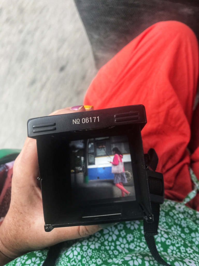
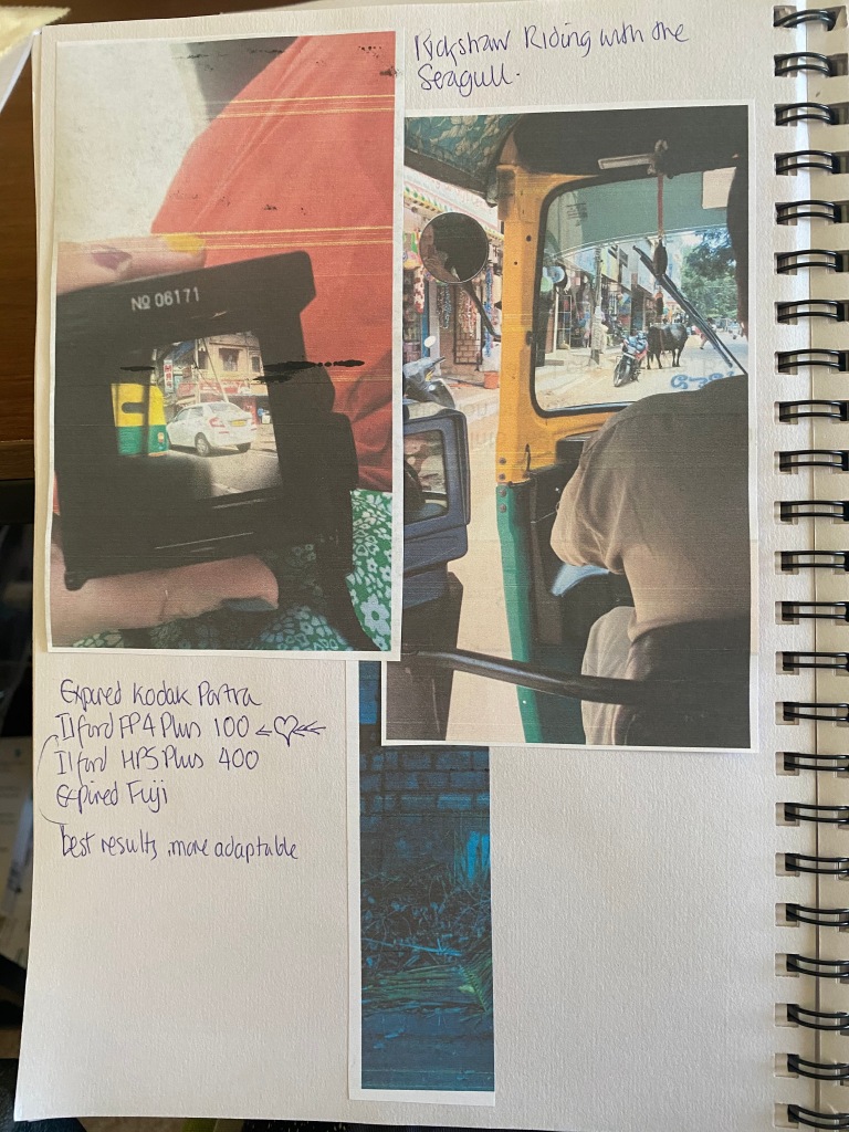
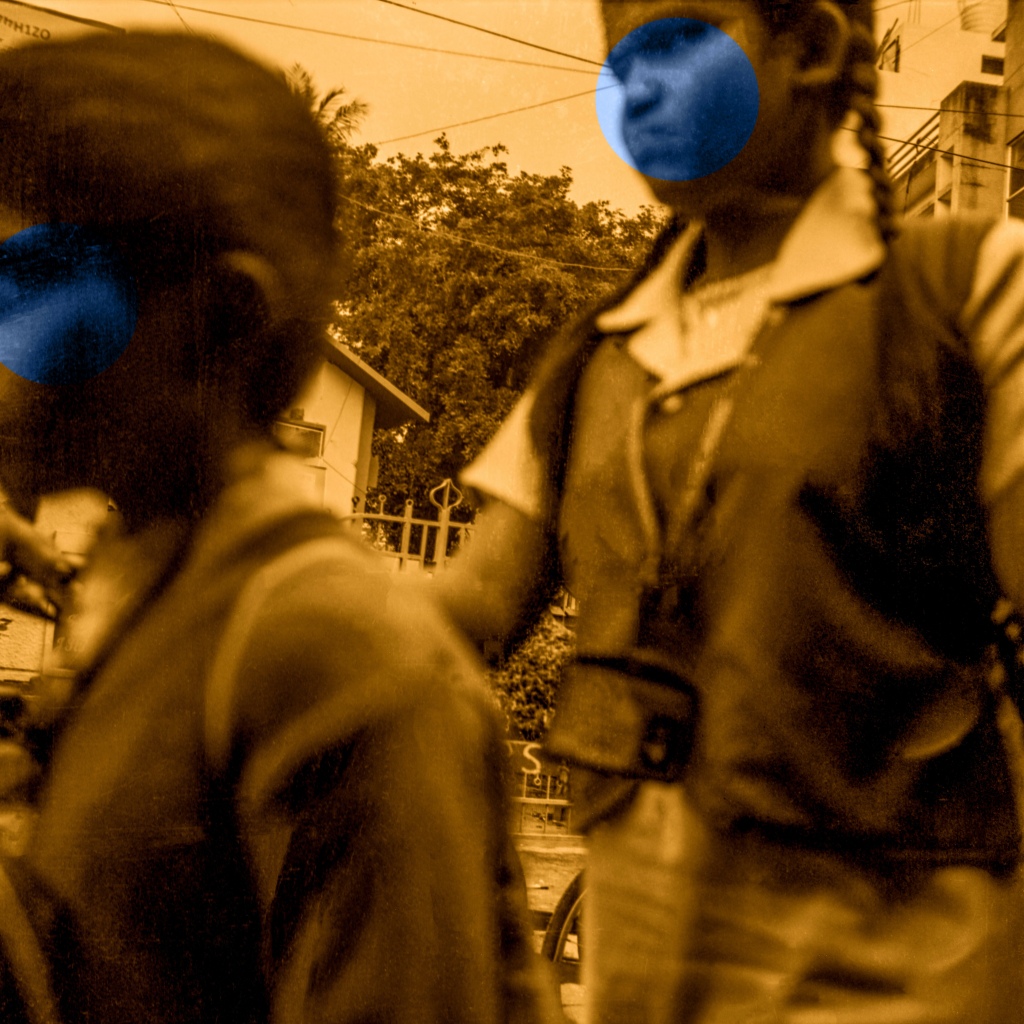
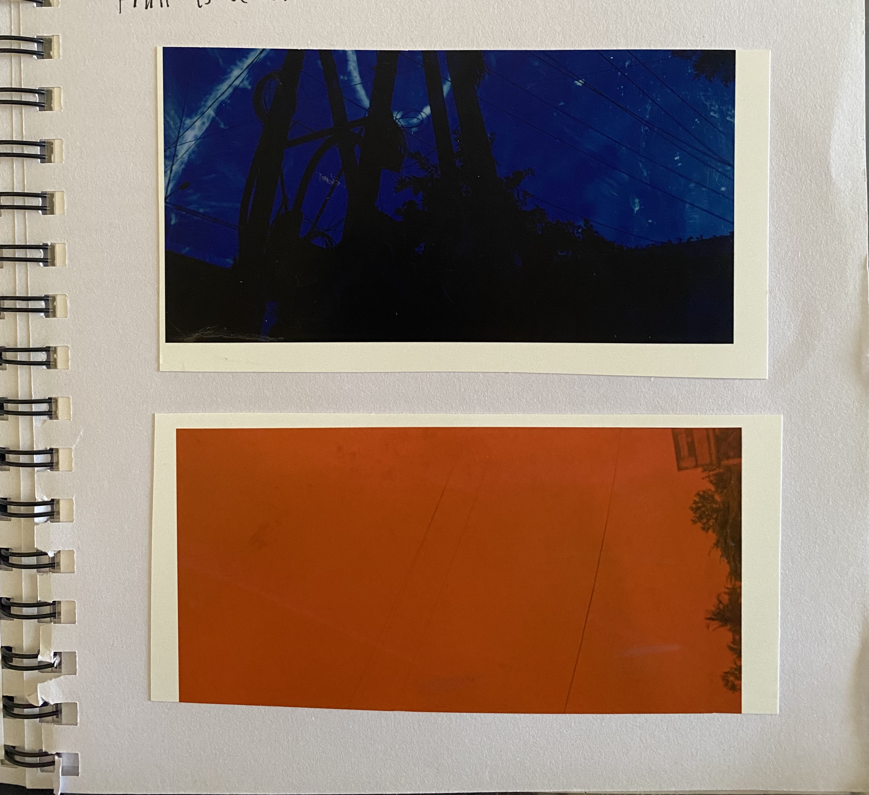
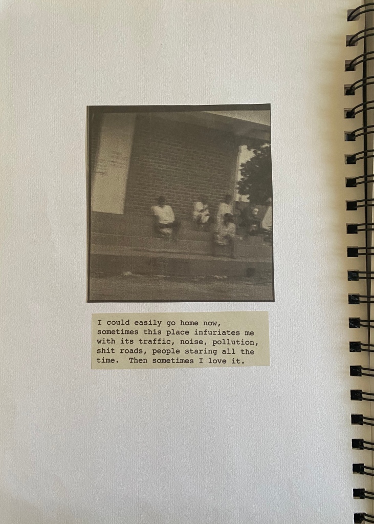
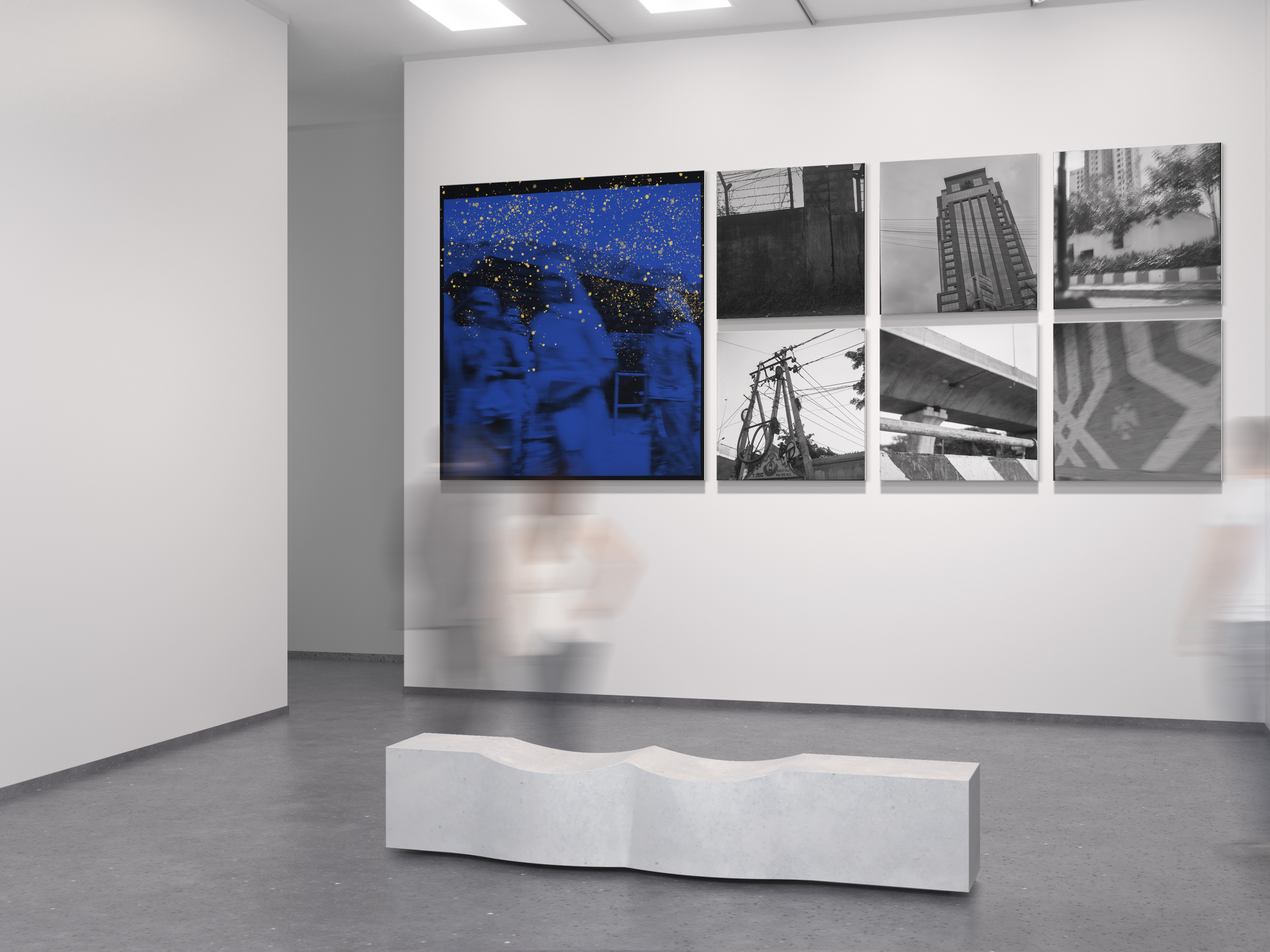
The idea unexpectedly came to me whilst I was sitting with my Seagull Medium Format analogue camera in the back of an auto-rickshaw suffering a headache from the traffic fumes. City pollution levels are regularly at levels considered to be hazardous to health (www.waqi.info) so all the residents of Bangalore have little choice but to live and breathe it. From then on I decided to use the rickshaw as my observational platform, which I found toxic but fascinating, travelling around observing everything and everyone going about their daily living. It took some time to be comfortable with the process of capturing people without their knowledge as street photography is something quite alien to me. I feel I am getting something much more intimate when people are unaware they are being observed, or capturing that fleeting moment of realisation, it’s like a guilty pleasure.
I also went to see a play at the Courtyard in Bangalore; Mondays are Best for Flying Out of Windows (left below), one of my first cultural experiences in India. During a Q&A at the beginning of the play, listening to the younger members of the audience, it highlighted the situation how the current GenZ demographic see themselves; with greater social conscience, gender fluid, unisex, self empowerment, environmental campaigners. Do the generation behind them, if there is one (they didn’t seem to think so) have a future? In an interview with Bloomsbury Academic, author of ‘Searching for the Anthropocene’ Christopher Schaberg, states that he feels a sense of melancholy and hopelessness, a palpable anxiety from his students regarding their/our future. He feels he can be more forthright with them but agrees to tone down the rhetoric as not to alarm younger children. I agree with the sense of anxiety having read and listened to large amounts of texts, facts and figures about how much damage we have done and are continuing to do to our planet, its disturbing. There are no positives to come away with, so if you are continually exposed to this literature its no surprise that the mental health issues amongst the younger generation are soaring, there is only a sense of impending doom.
This seems so bizarre updating this at the moment given the situation we have right now where climate change has literally undergone its most momentous rehabilitation in the past 50+ years. The statistics over this period with regards to pollution levels are going to be very interesting.

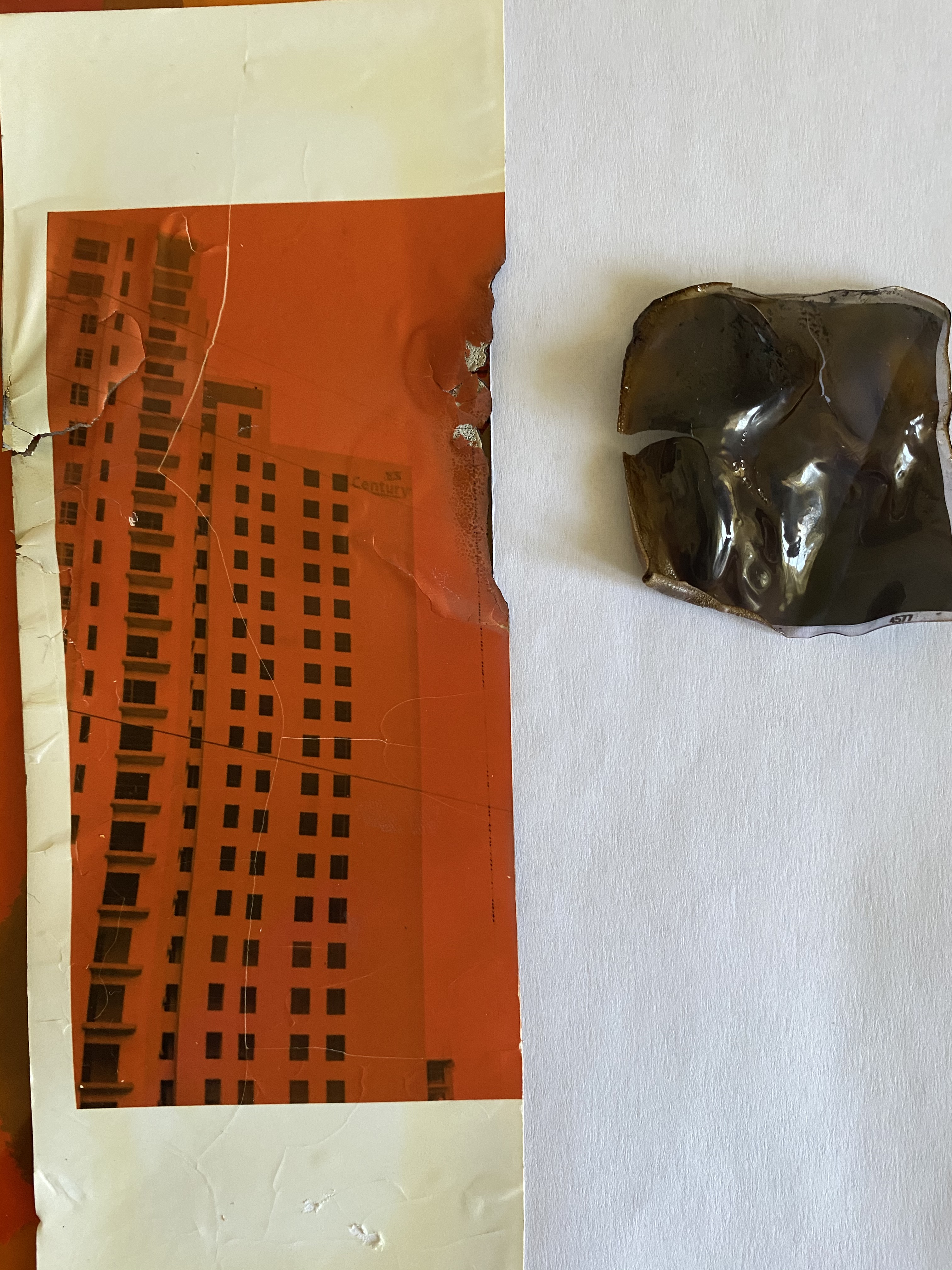
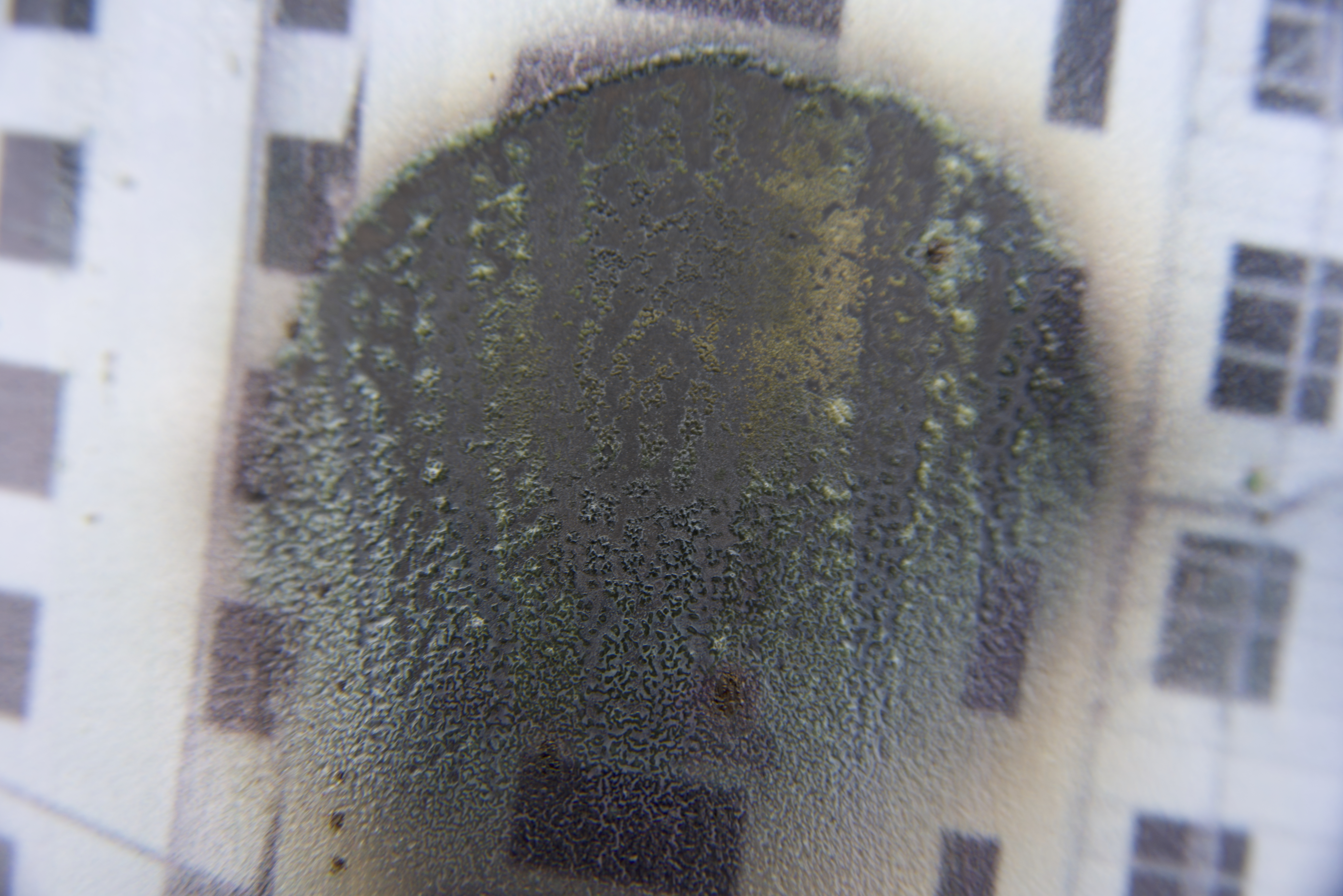
I visited an exhibition in Mumbai Museum of Modern Art celebrating Mahatma Gandhi 150 Years. There were some stunning images which had the appearance of crackled glass effect on them but it was no effect, it was the damage of years of isolation in some backroom until they were rediscovered. Things like this fascinate me, its life journey shows in every pore of its being, existence, like all its lifetime locked in. (Right above)
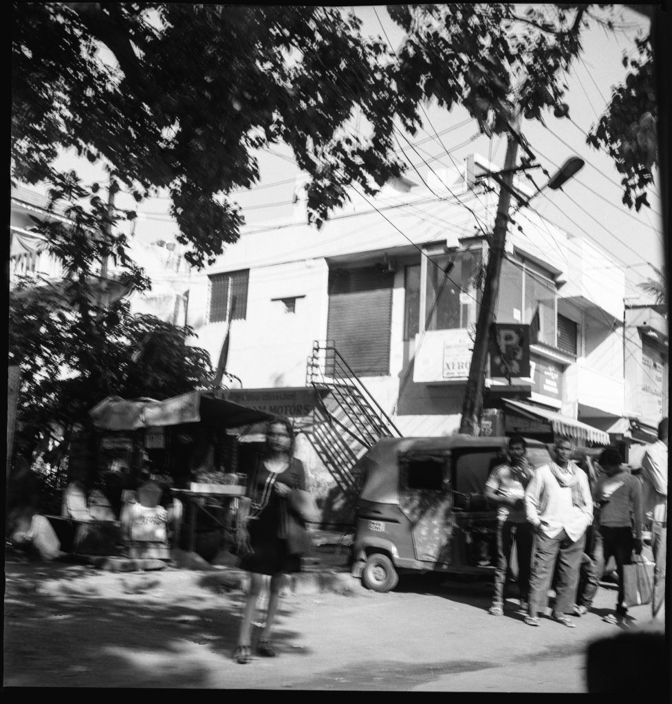
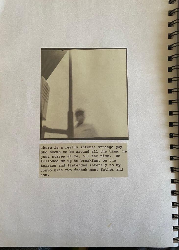
There are particular images that give off a heightened sense of realisation from the developed film, in that fleeting moment they look directly at you, momentarily confused and you capture it. The image below, particularly the gentleman in the white shirt and scarf who has a slightly malevolent look about him, his stare making me feel uncomfortable, I get such a sense of different emotions from it every time I look at it, also the girl in it has a real vulnerability about her. It’s confusing reading.
I am continuing to look at various street photographers, in a way I’m looking to validate my process of capture hoping that someone doesn’t just say “that’s just a shit blurry picture” which they can do but I’m aiming not to agree you see! I see movement, motion, activity, everyone is doing something, busy, bustling, vibrant lives. By looking at the work of others I can see that the initial images that I’ve developed can actually turn into something more tangible and I suddenly feel quite passionate about my work. My doubts come and go though and at times I have to stop myself from over-thinking and being overly critical of my work, I need to try and be positive more often. I think its because being in India on my own I have very little by way of sound-boarding or discussion from tutors or my cohort and feel slightly abandoned and forgotten. I see how important it is to get feedback for your work; to give you confidence, consider new ideas and identify weaknesses. I see it now I don’t have it, lessons learnt.
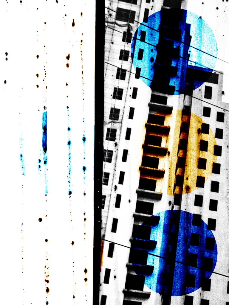
I am looking at bringing pollution into the framework so I’ve started investigating how I can contaminate my images by researching various forms of pollution. I feel that this will add the context I am looking for; environmental poisoning, low quality air.
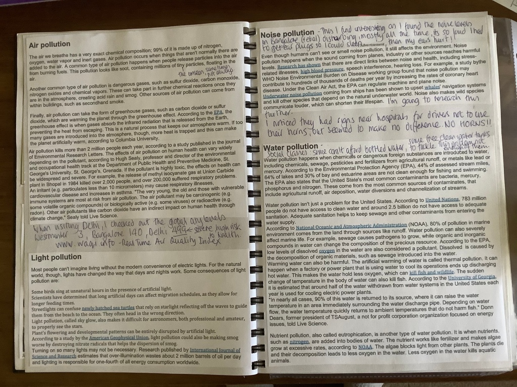
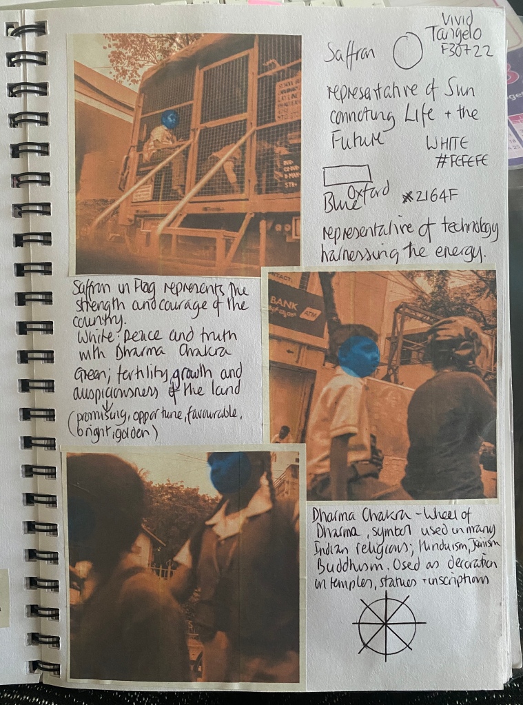
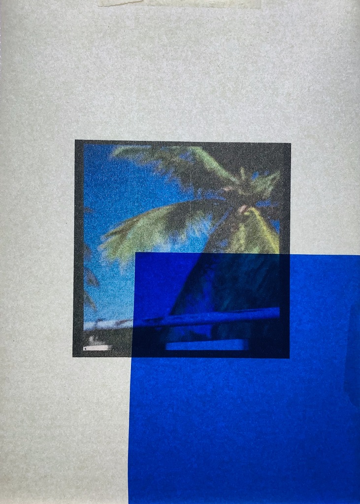
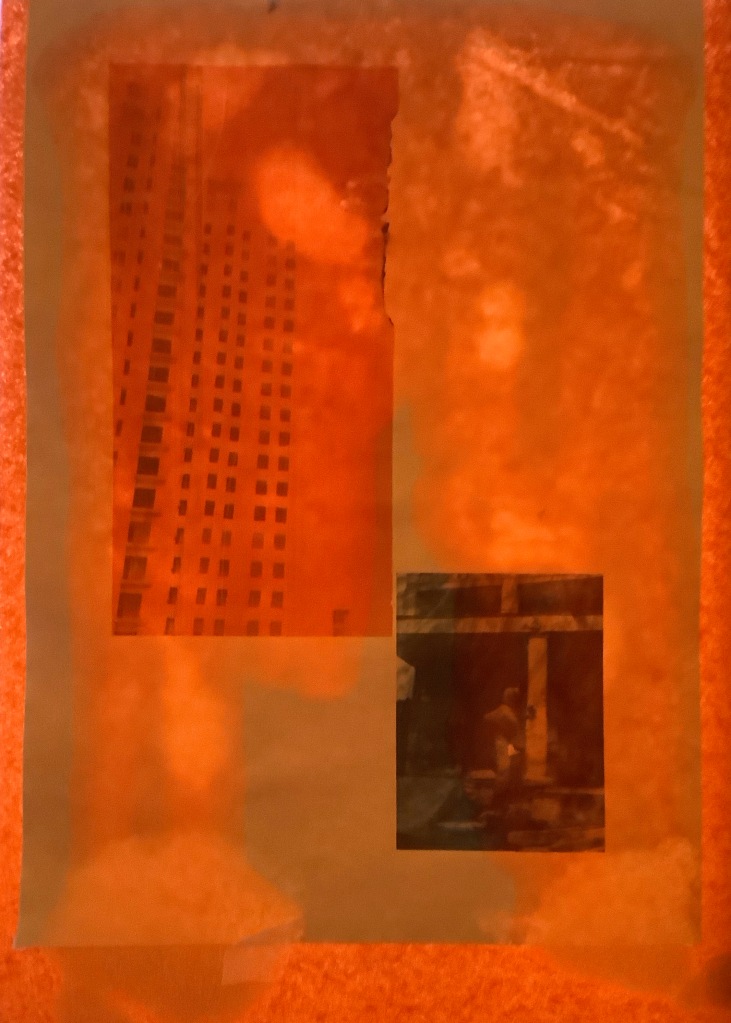
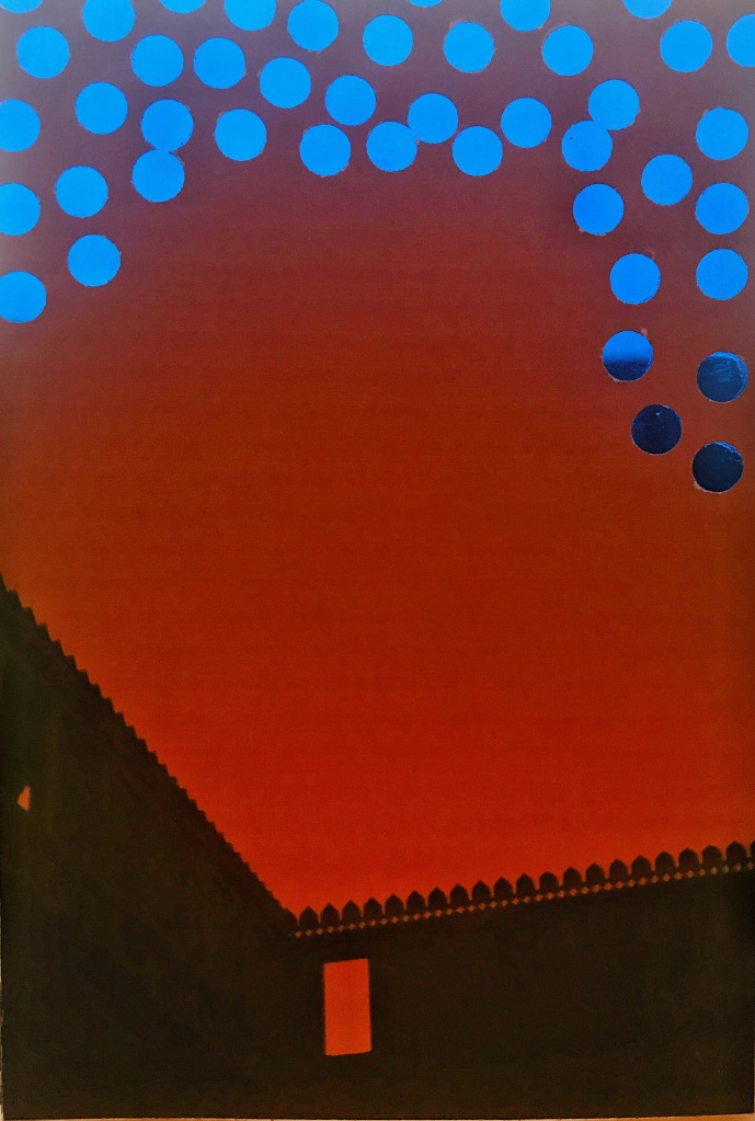
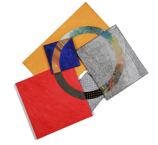
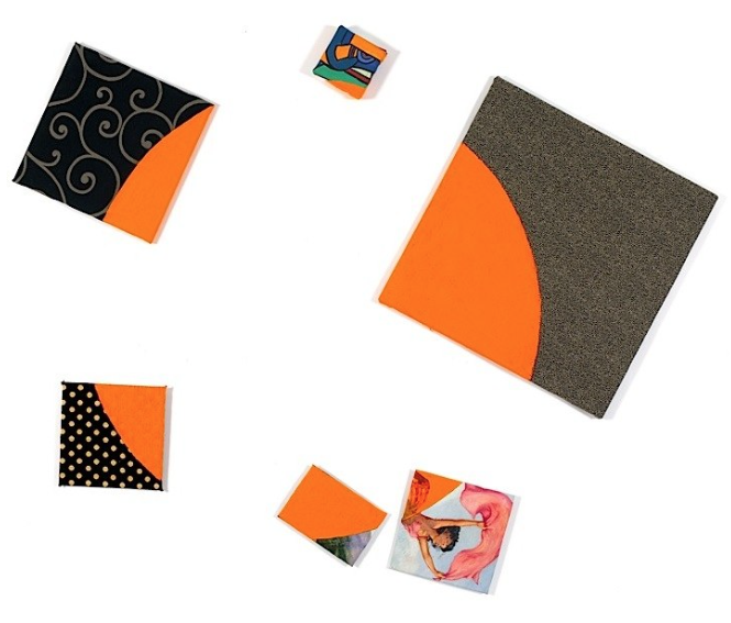
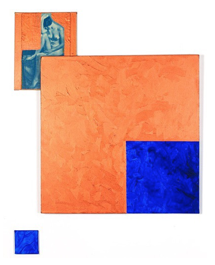
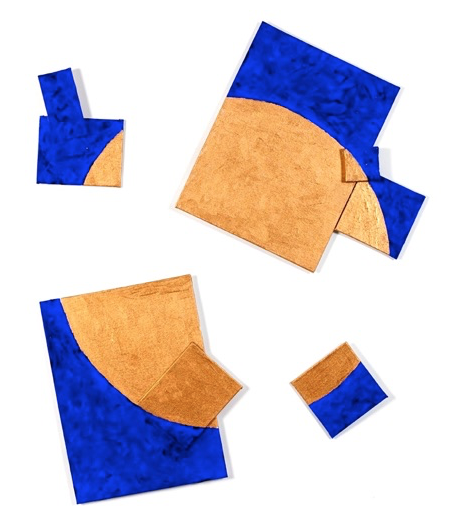
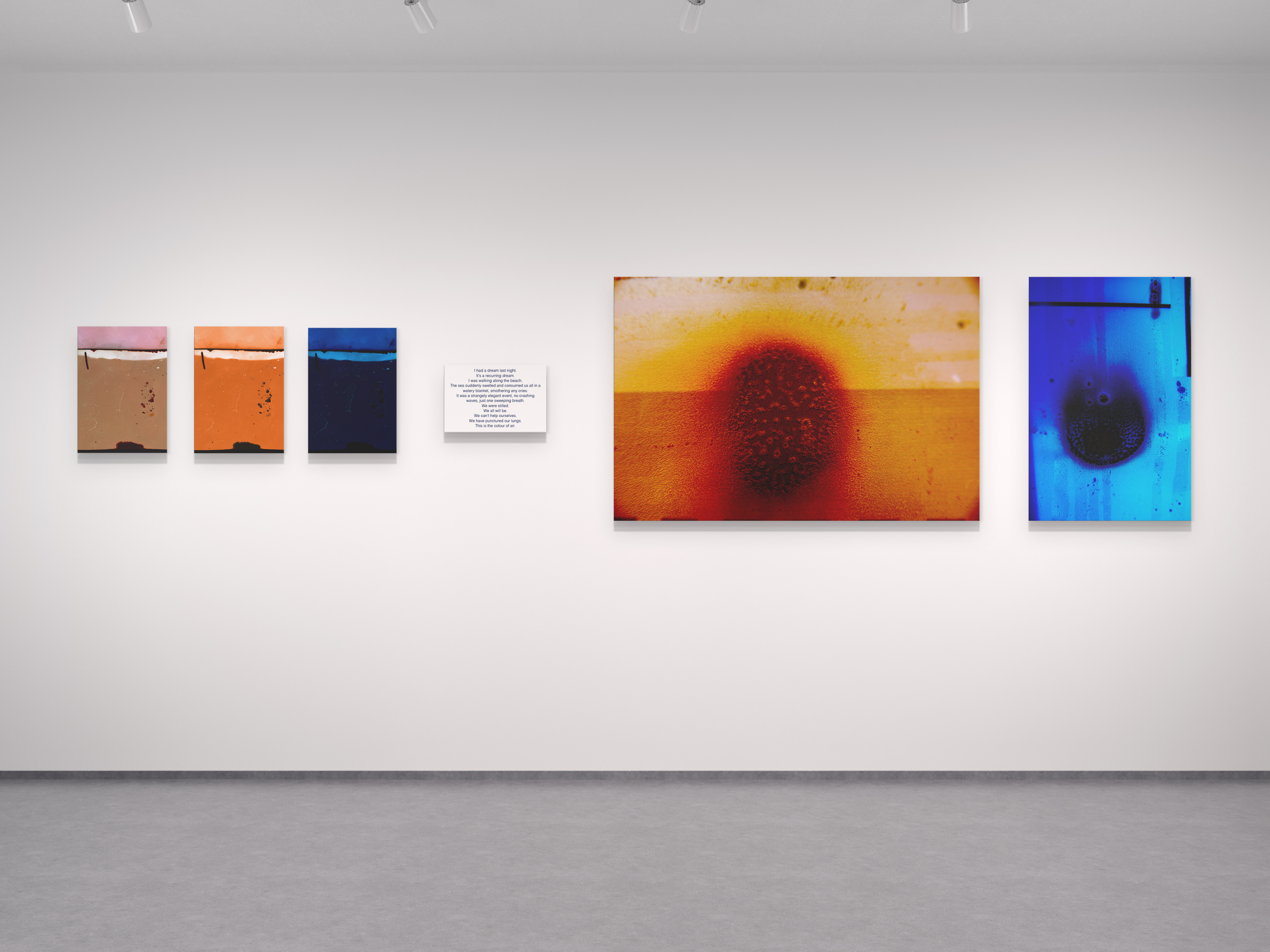
Whilst researching I came across various articles on the world’s biggest fossil fuel polluters who produce a third of all carbon emissions. By looking at various companies and their logos I became intrigued about their design and what they purport to represent, particularly focusing on IndianOil being in India. The saffron circle represents energy as a derivative of the Sun, connoting life and the future. The dark blue outer ring and the horizontal band symbolise technology for harnessing this energy.
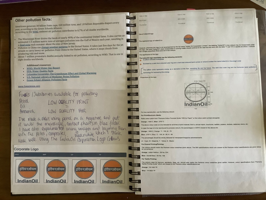
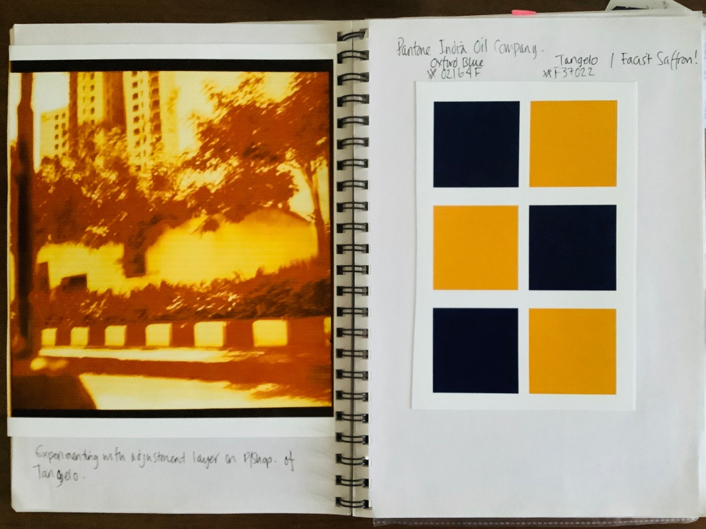
Drawing on inspiration from the Indian Oil logo I have experimented with adjustments layers, the circle of life? and the colours of Tangelo and Oxford Blue. I want to use oil, petrol and other toxic ingredients to see what effect it has on negatives, photo paper or film paper, acetate and any other surface I can think of.


I have submitted three of these for the Lightbox show as its all I have currently (as of October 2019). The project is starting to progress a little faster. The lack of facilities in India definitely impacted on my productivity. I concentrated on getting a good body of images to work with on my return to the UK even if I can’t get all the developing done here it can be done back home. I also worried that being here for 3 months may impact on the time I have to produce my final work. I can’t seem to make firm decisions about the outcome I’m hoping for, I’m frustrated with myself!
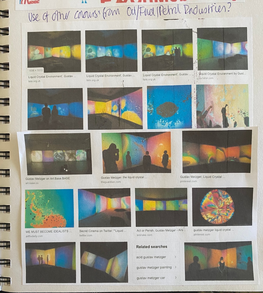
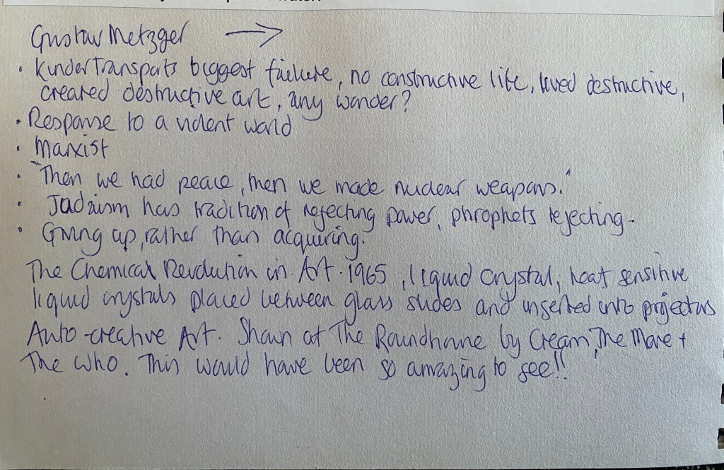
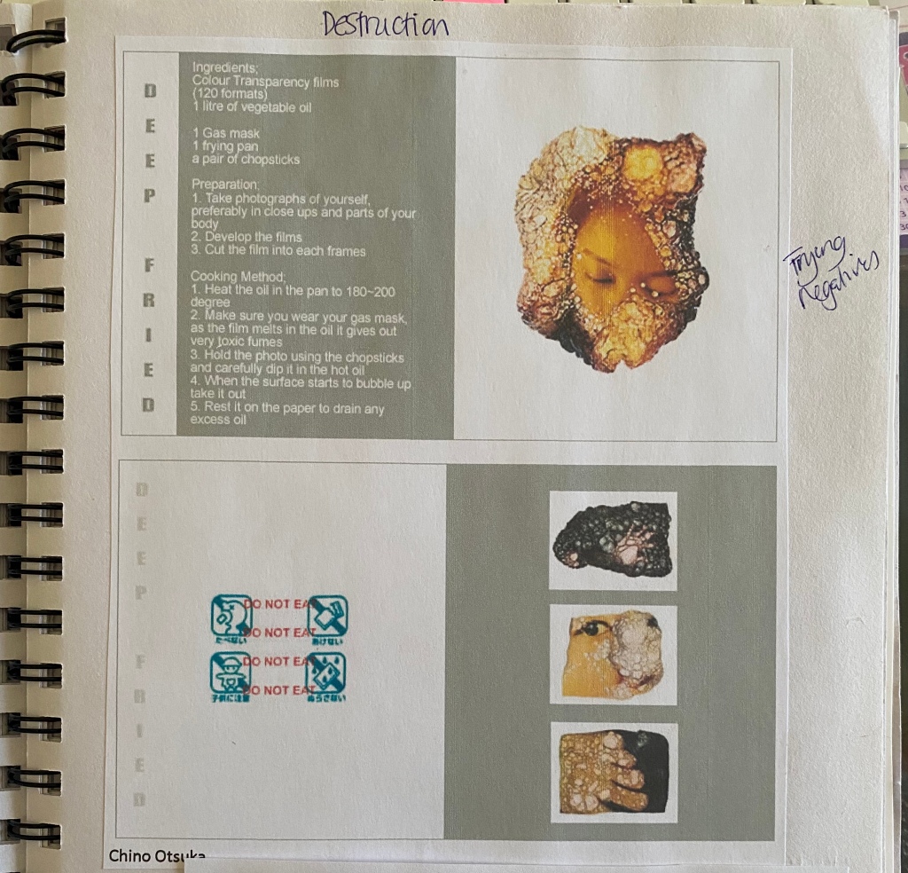
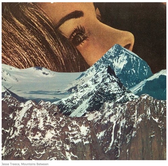
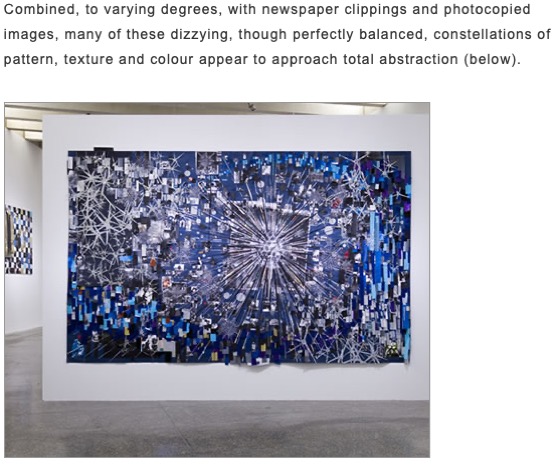
Researching brings me back to the work of Baldessari quite often, his use of text interests me, more of that later. Similarly looking at other types of destructive art, Gustav Metzger’s art in response to a violent world; Chino Otsuka (Deep Fried) frying negatives, less destructive but using mixed media, artist Joana Choumali (Ca va Aller (it’s going to be alright) embroidered images of the Ivory Coast, Sophie Gabrielle (Worry for the Fruit the Birds Won’t Eat).


3 weeks after the attacks, the atmosphere of the little town changed. The sadness is everywhere. A “saudade”, some kind of melancholy invaded the town.
Most of the pictures show empty places, and people by themselves, walking in the streets or just standing, sitting alone, lost in their thoughts. “ça va aller” means “it will be ok”. This typical ivorian expression is used for everything, even for situations that are not going to be ok.
Bassam is my refuge, the place i go to unwind and to be by myself. At one hour drive from Abidjan, Bassam is a place full of history, a quiet and peaceful little town. Bassam reminds me of insouciance, all these childhood sunday afternoons i used to spend with my loved ones on this same beach where the attacks took place.
To me, Bassam was a synonym of happiness, until that day.
In Côte d’Ivoire, people do not discuss their psychological issues, or feelings. A post-traumatic state is often considered as weakness or a mental disease. People hardly talk about their feelings, and each conversation is quickly shortened by a resigned ” ça va aller”. This work is a way to address the way ivorian people deal with mental health.
The attacks re-opened the mental wounds left by the post electoral war of 2011.
Each stitch was a way to recover, to lie down the emotions, the loneliness, and mixed feelings i felt. As an automatic scripture, the act of adding colorful stitches on the pictures has had a soothing effect on me, like a meditation. Embroidery was an act of hope, as well.

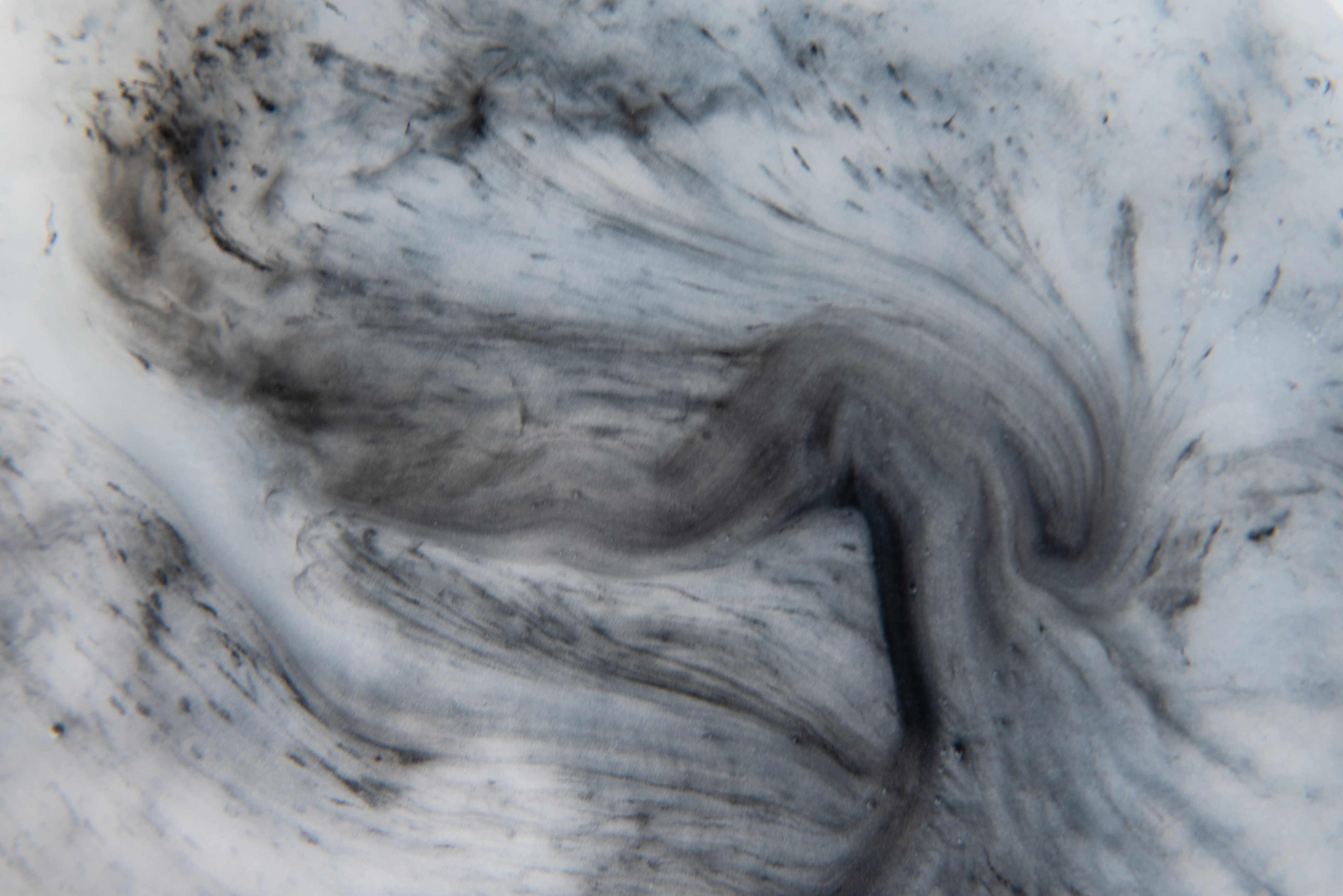
I’ve started working on the destructive process with punching holes, bleach, petrol, oil and cleaning fluids just to test how they would work. The damage isn’t as significant as I thought it could have been so I’ve also partially burnt them.

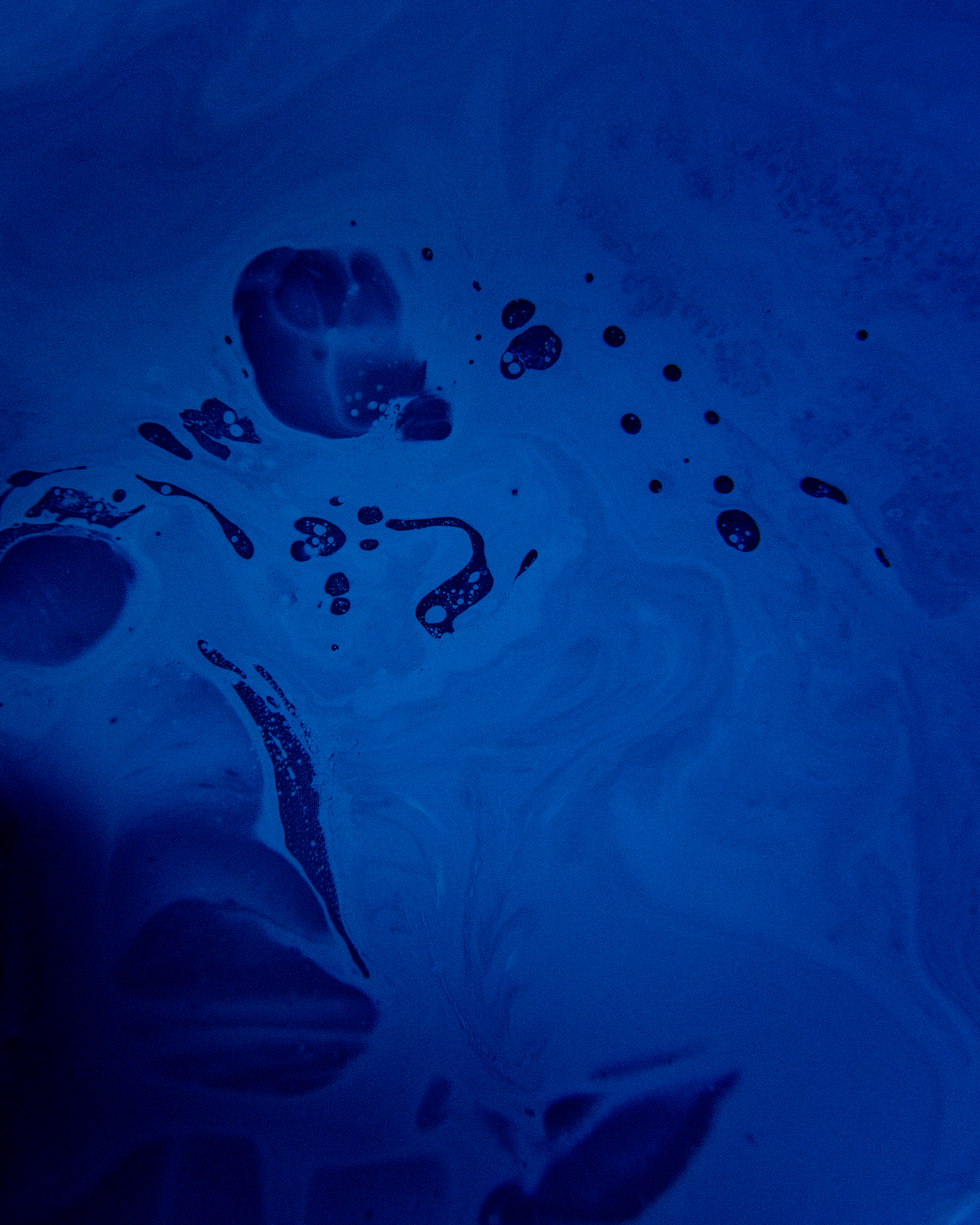
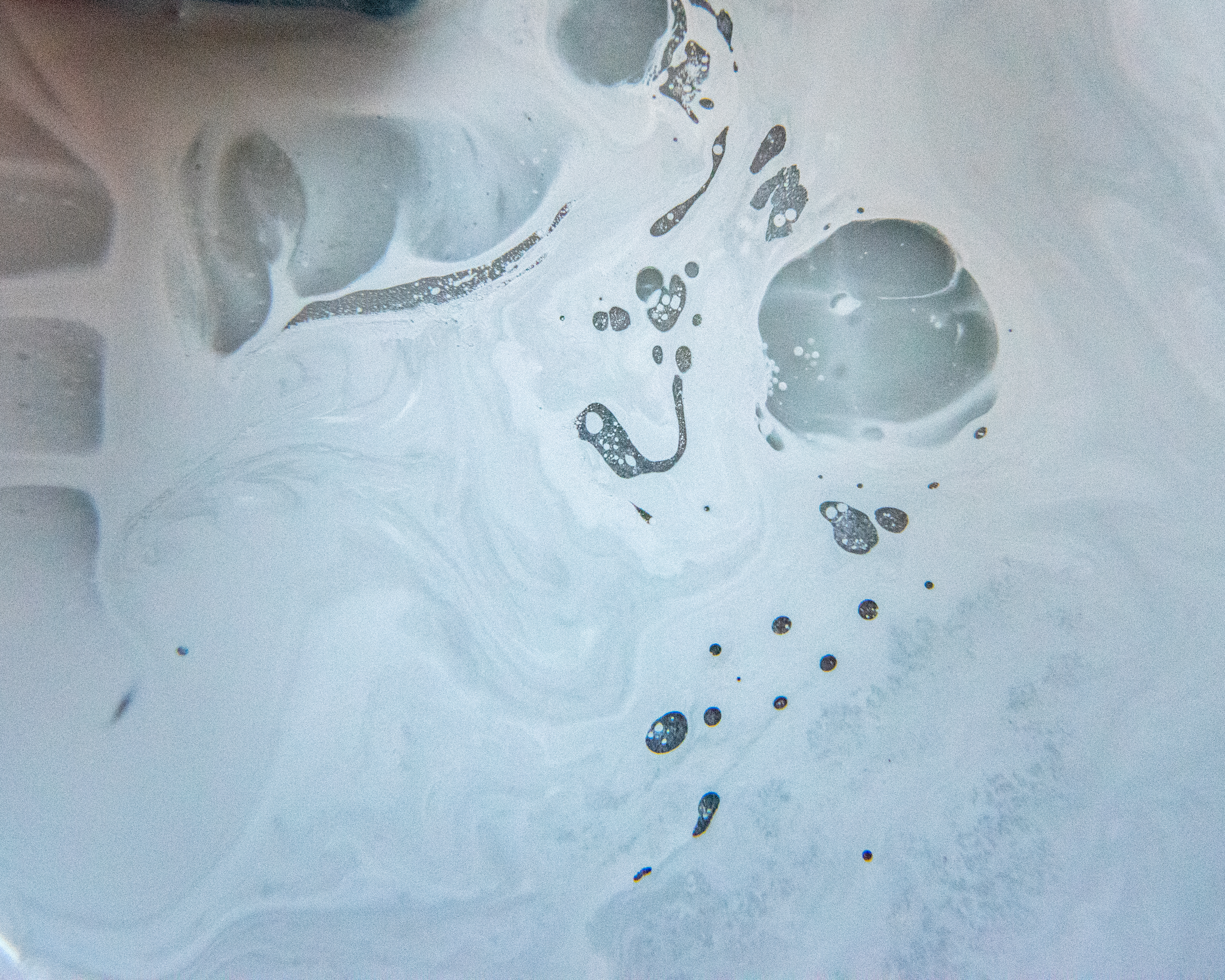
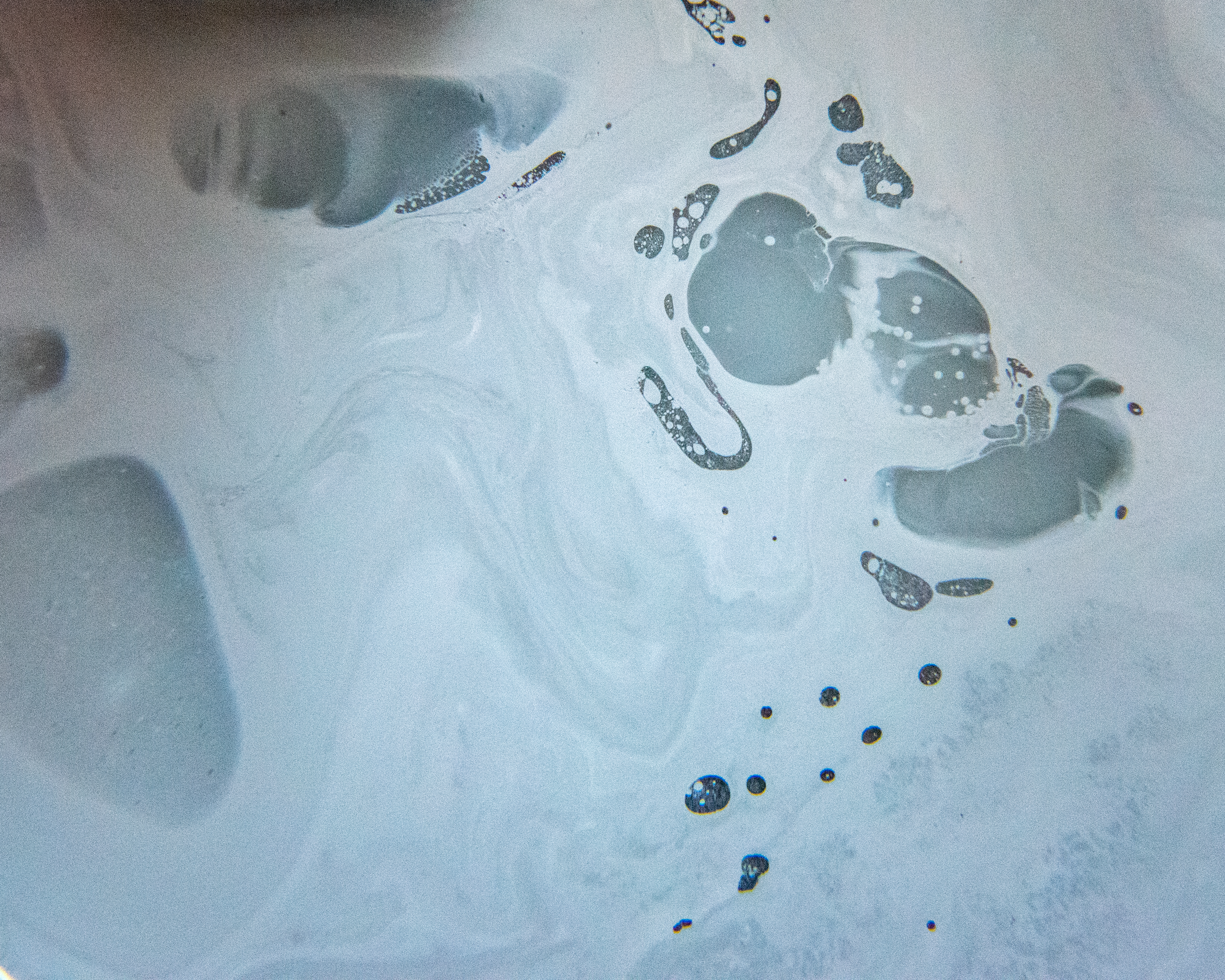
I placed a negative into some kitchen cleaner for a couple of hours and when I removed it, the image had completely vanished from the surface of the negative but the latent image was swirling around in the fluid, I subsequently photographed it and then used it for some experimental double exposures in Photoshop. It’s quite exciting how the unexpected turns into an aesthetic that can be incorporated into creating something unique.

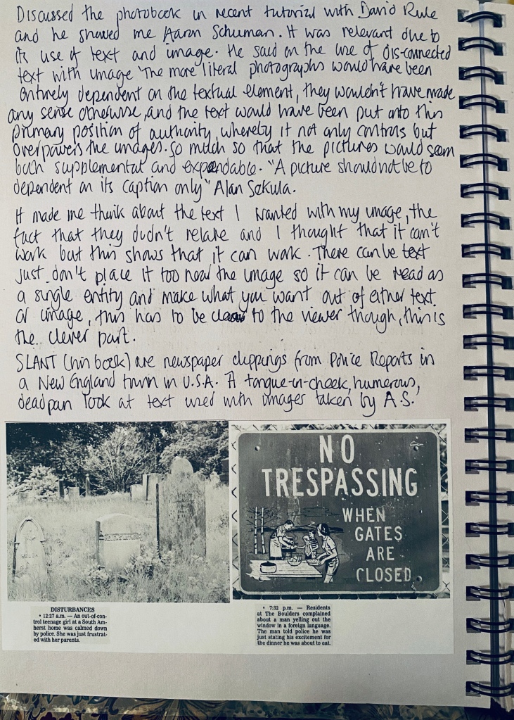
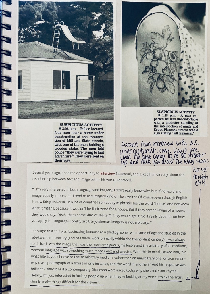
Returning home to the UK I have also started to consider using text. I kept a diary in India, which I love reading back. It gives me wonderful and strange memories of something that I have to pinch myself in the realisation that I actually did it. Researching text with image I came across Aaron Schuman, amongst others of course, but I wasn’t wanting to be to literal with the relationship between the two but unsure whether the ambiguous approach would work well; “A picture should not be dependent on its caption only” Alan Sekula. Schuman’s book, Slant, is made up of newspaper text clippings of police reports that he and his father used to find amusing when he returned to his hometown in New England, USA. He produced the book using these clips and images he made of the town on his visits. They are very tongue-in-cheek and humorous.
I had started to compile some examples of how I envisaged the pages might look as a documentary diaristic style book or newspaper. I found a fantastic travel diary by Magnum at the Impressions Gallery in Bradford (after I had come back from my trip sadly) which I bought to use sometime in the future, I also purchased some fantastic examples of newspapers produced by artists as a means of exhibiting their work. The Newspaper Club is one major player in the production of tabloids, broadsheets, zines, etc so I ordered samples of their papers. The costs were pretty reasonable for tabloids but zines had a minimum order of 100 and the cost became quite high, good for a show where others are contributing but I can’t commit to £300 as an individual even if they were my favourite size.

I have a short video below giving an excerpt from my sketchbook referencing my research into publishing. I also have a previous post on this site titled “Self Publishing or Publishing House”, it’s an essay I did during my BA (Hons) Photography which is still quite relevant.
https://drive.google.com/file/d/1LjwL2HuRQGsnXavVBb9j08mk7DKCqx46/view?usp=sharing
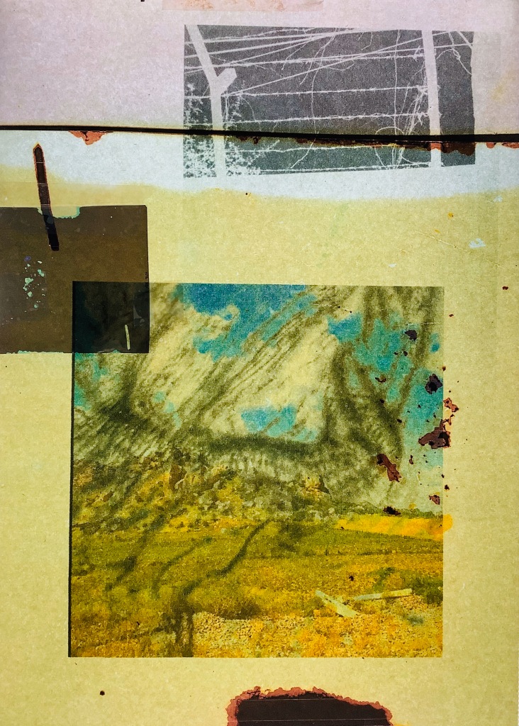
I have experimented with printing on newsprint, photo paper, acetate, tracing paper and collaging the various images. I have smeared oil and photographed it periodically as it consumes the paper, seeping into image, continuously changing.
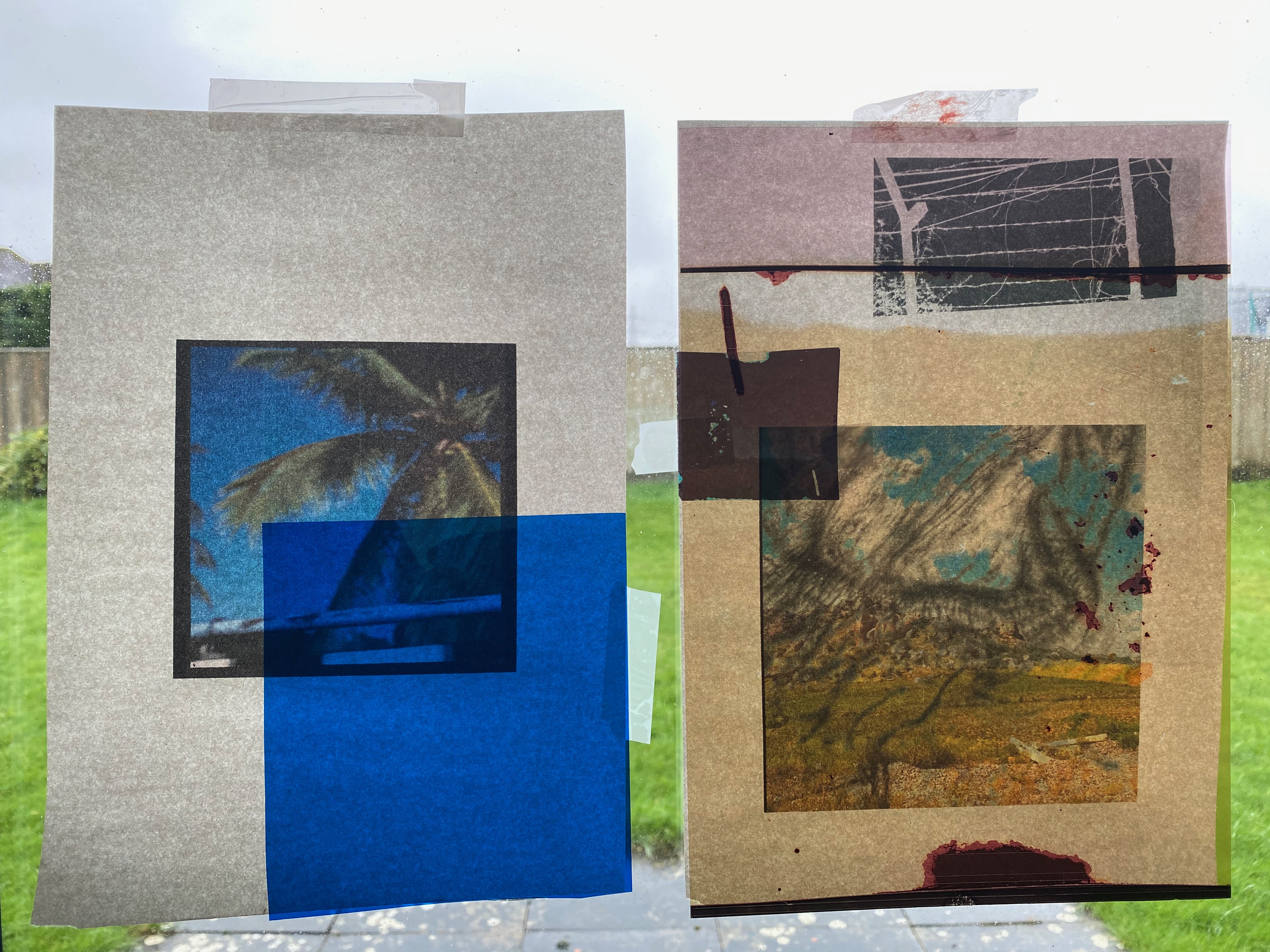
My favourite element about these is the process of crafting them and them being much more tangible than one singular image, I want people to want to touch them even if they can’t (not at the moment though, that’s forbidden!) to get a sense of the different edges, textures and layers. I have photographed them but they are very flat, still usable but its different for me personally.

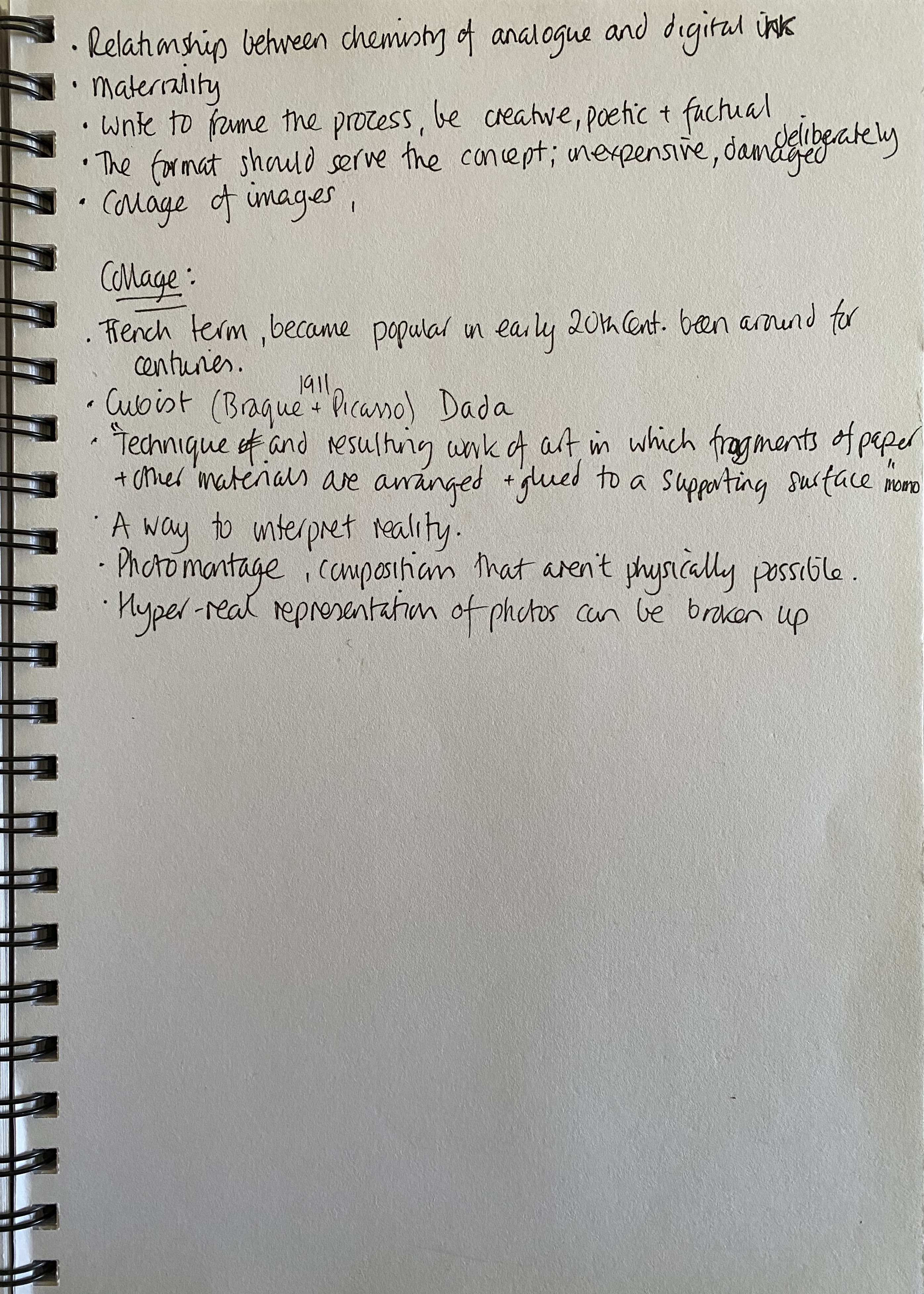
- Collage!!
- French term, became popular in early 20th Century photography but has been around for centuries.
- Cubist
- Dada
- Technique and resulting work of art in which fragments of paper and other materials are arranged and glued to a supporting surface
- A way to interpret reality
- Photomontage, compositions that aren’t physically possible
- Hyper-real representation of photos
- Broken up
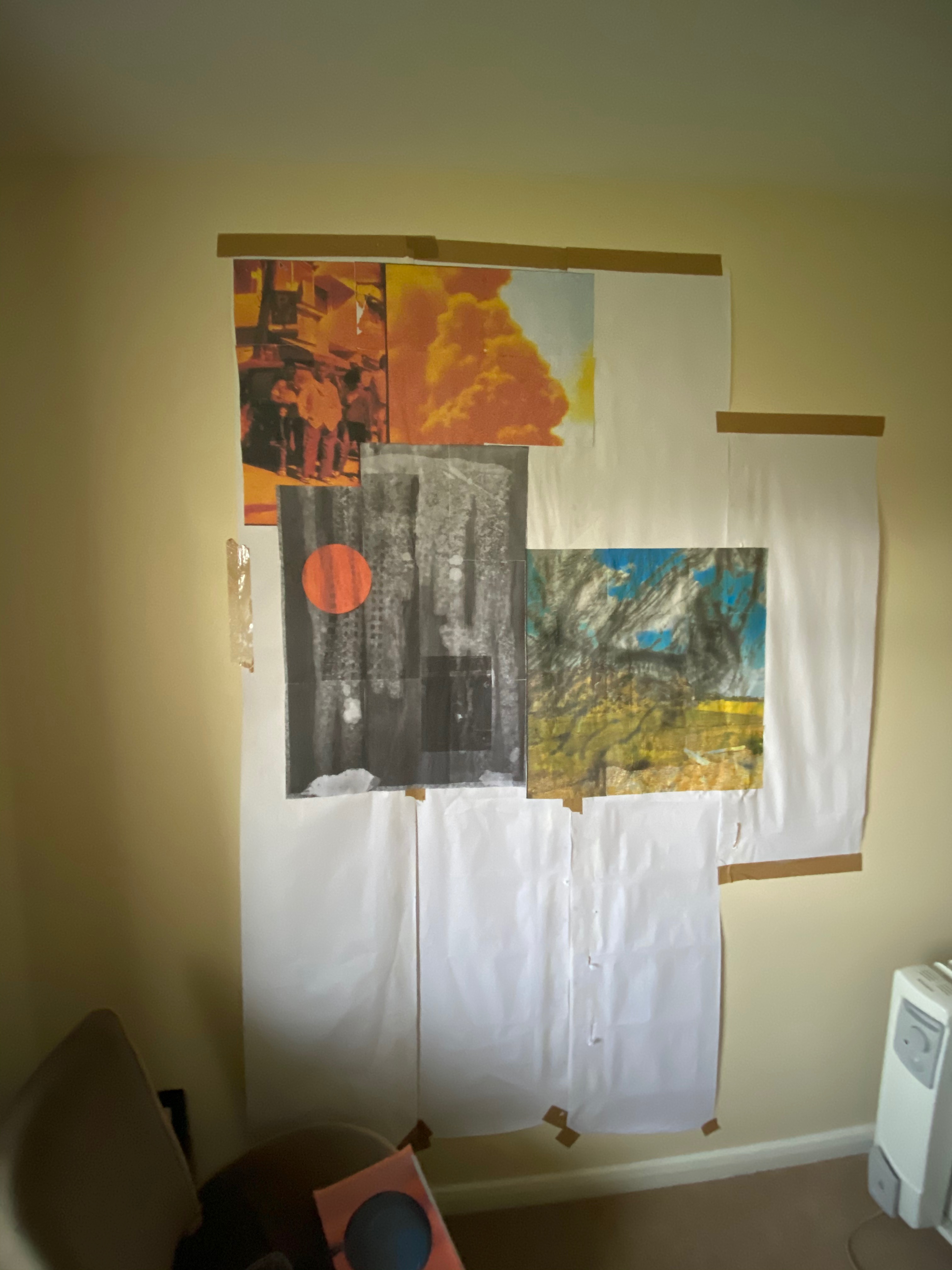
I decided to move out of my dining room/creative hub and into my own space in the spare room, apparently its being overwhelmed with my ‘stuff’. So off I go and realise I have now lots of wall space to play with so let’s not go bigger with the collage. I found some old roll paper in the garage, the mice had used some to make a bed, sorry mice but I’ve reappropriated what’s left for my use. I taped it to the wall, about 5ft x 4ft.

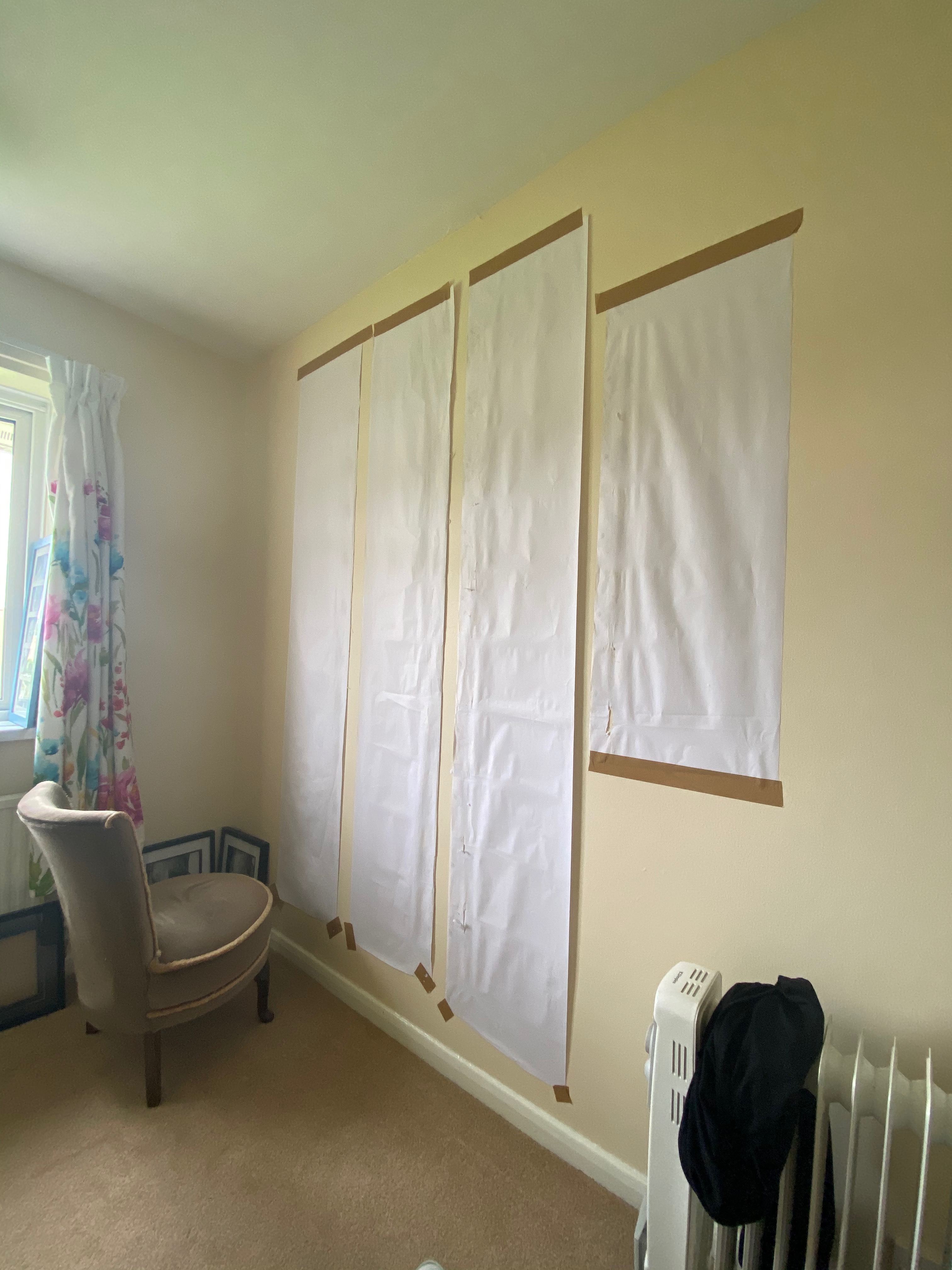

I started off with one image printed through the PDF poster option on Adobe as you can print it much larger in A4 sections, just piece it together after printing. I decided to use just an ordinary printer with standard paper set at its lowest quality, which is still not to poor. I feel that a project about low air quality, the poisoning of our world and ourselves would be more suited to this aesthetic, not some slick high quality Hahnemuhle required here.
The format should serve the concept; inexpensive, deliberately damaged collage of images.
I can honestly say I have loved collaging, its slightly slow starting out but once your ideas come together its an extremely satisfying way of creating art work. What I find I also prefer is the actual piece as it really is, as I have done a digital version. Rather than re-photographing it using the actual work I have measured a canvas to scale and then dragged each digital image in replicate. This digital version is fit for its purpose but I find it flat and lacking in character. The work on my wall has lots of texture, the glue has slightly damaged or rippled the paper in part, when I run my hand over it, it makes sound, there are some mouse tears; for me all these imperfections transforms it into a more 3D visual than a flat object. There is a video below showing a more visual experience.
fhttps://drive.google.com/file/d/1rbzs_bjJyAJgUqDGwuzK5nSJI0vgJUbO/view?usp=sharing
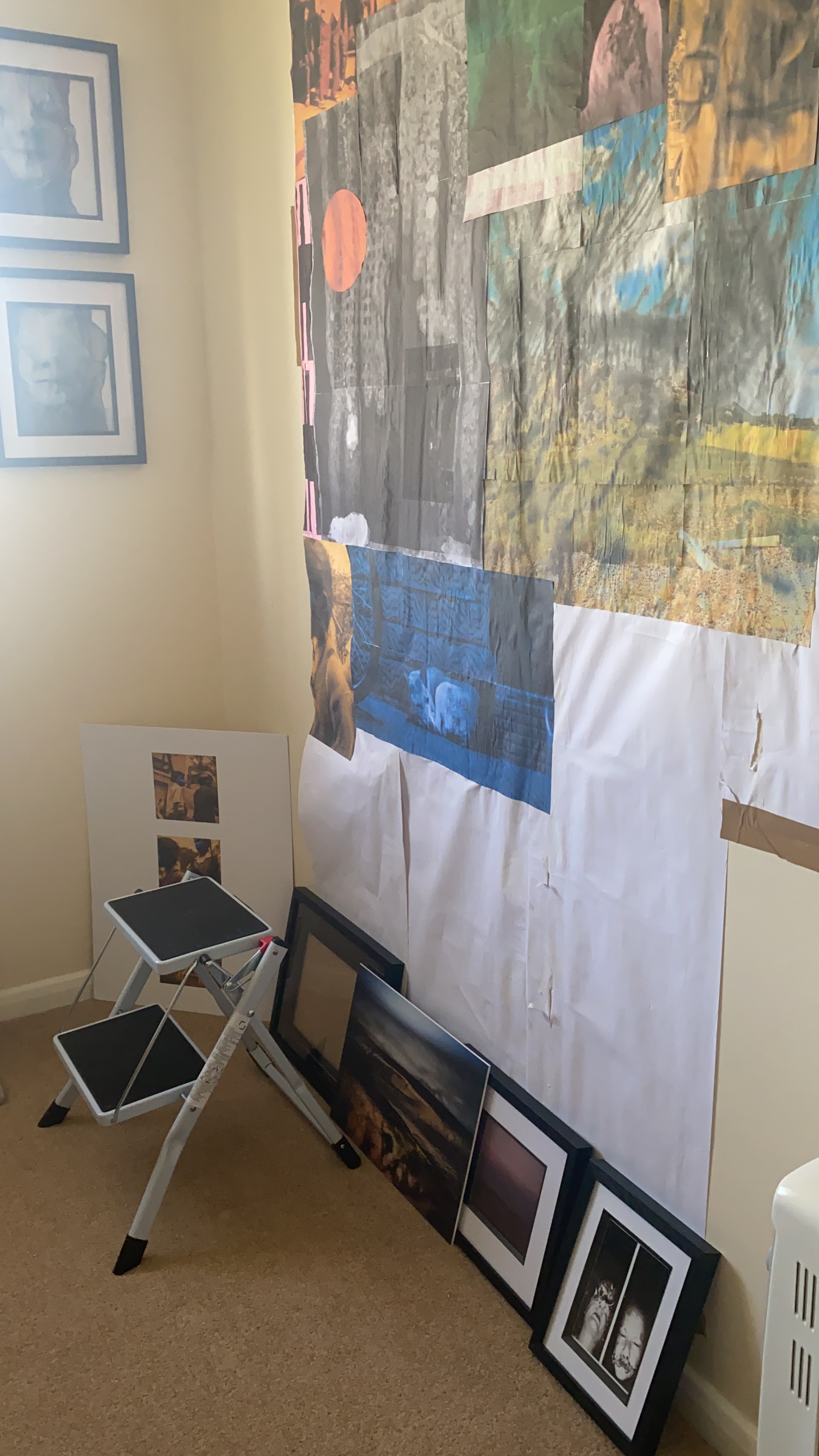
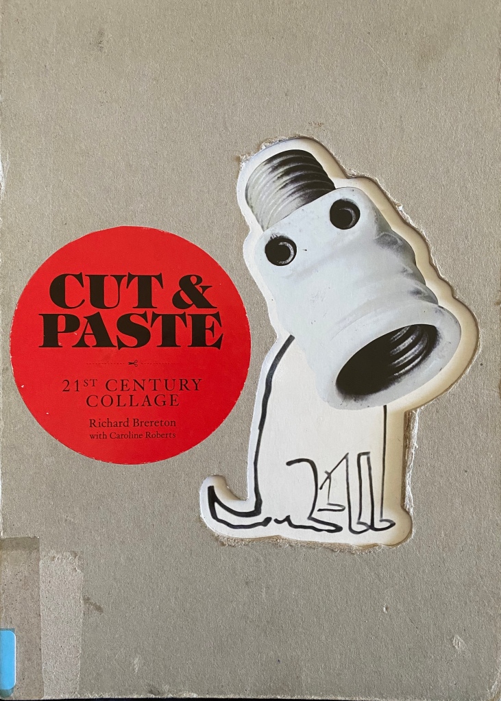
I think I possibly got my last book out of the UCA library two weeks ago; “Cut & Paste, 21st Century Collage by Richard Brereton and Caroline Roberts to look at some more contemporary collage artists. Below is the forward and I’ve even collaged some of the works in the book on to it.


The Nancy Spero work has made me look into maybe adding text again. I’m going to create another collage and may incorporate this, see if it works, but more research in the meantime.
After tutorials and much discussion about trying to run two simultaneous projects for a final outcome I took the decision to defer the diary/book a project for another time. I have a substantial body of work with which to produce the project but feel that currently the strength lies in my abstract composition of images and other media into a collage piece, or two.
W/C March 30
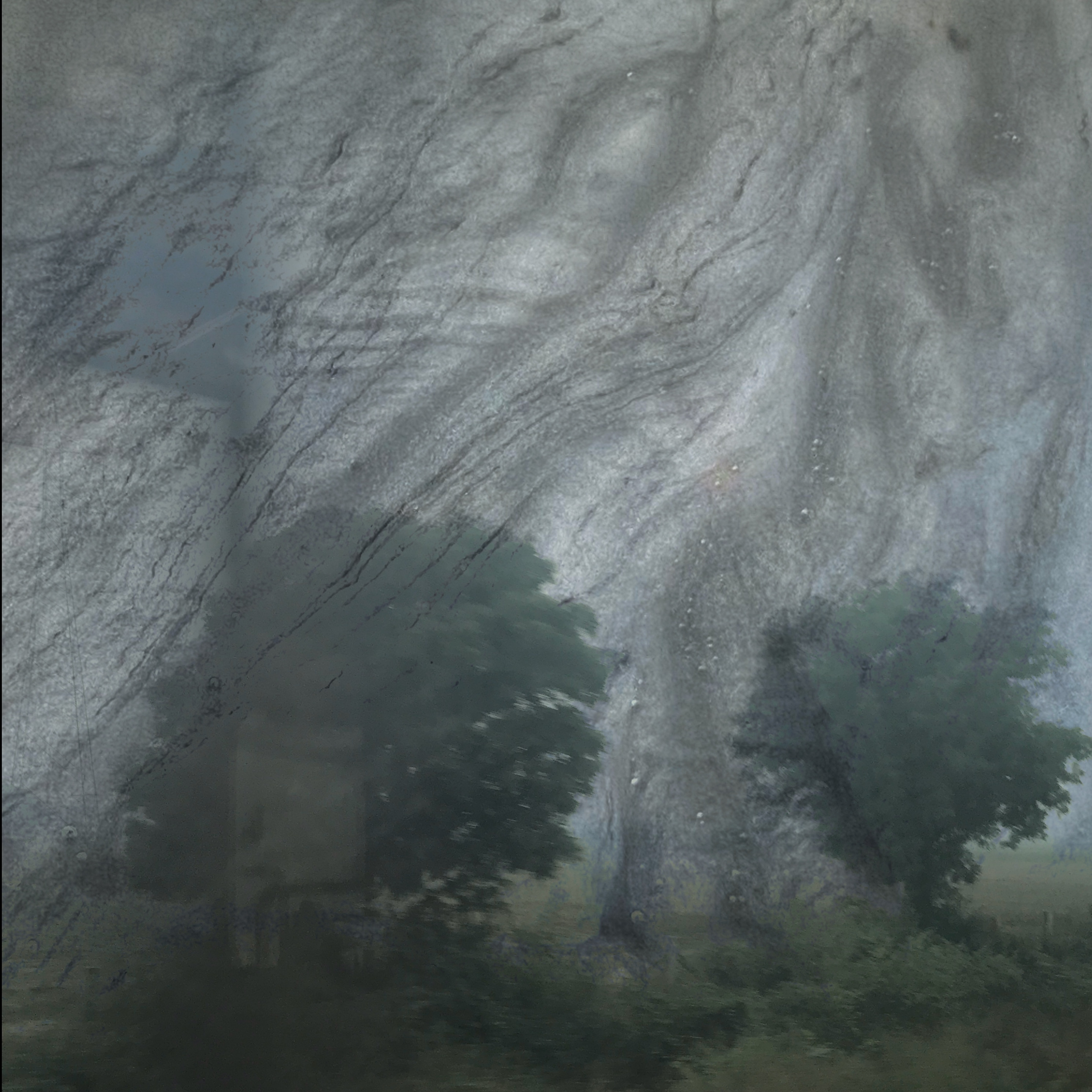
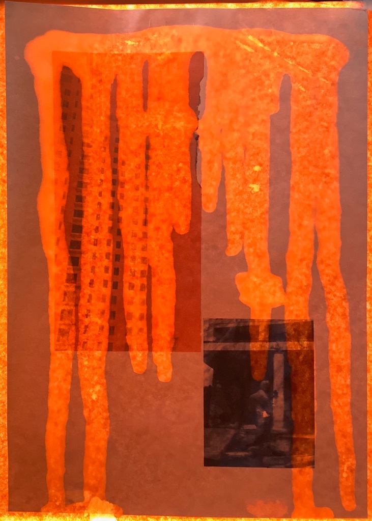
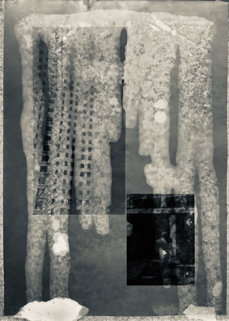
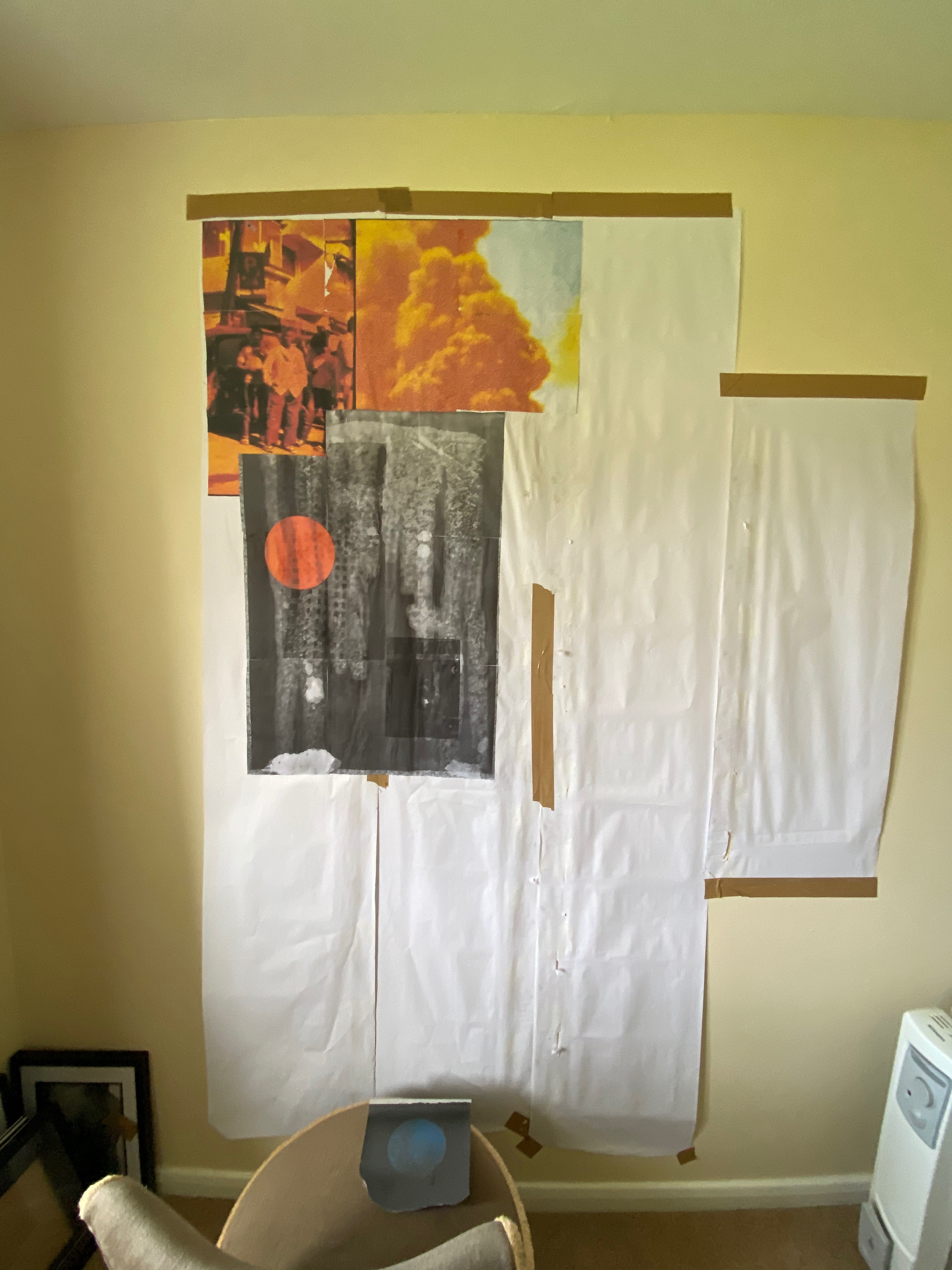
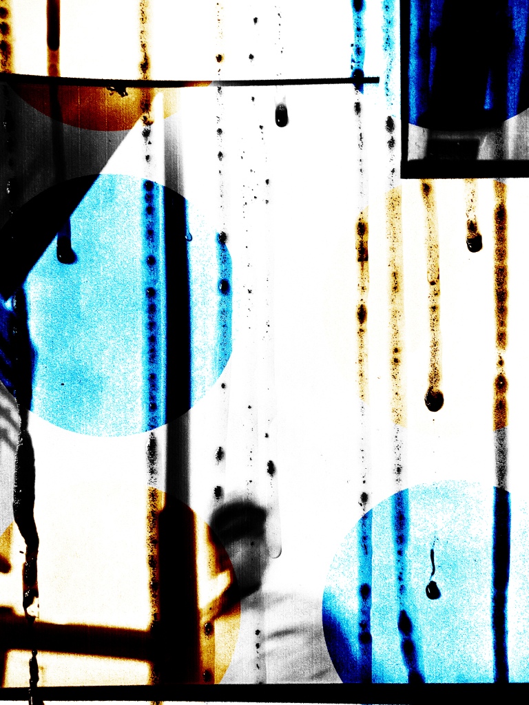
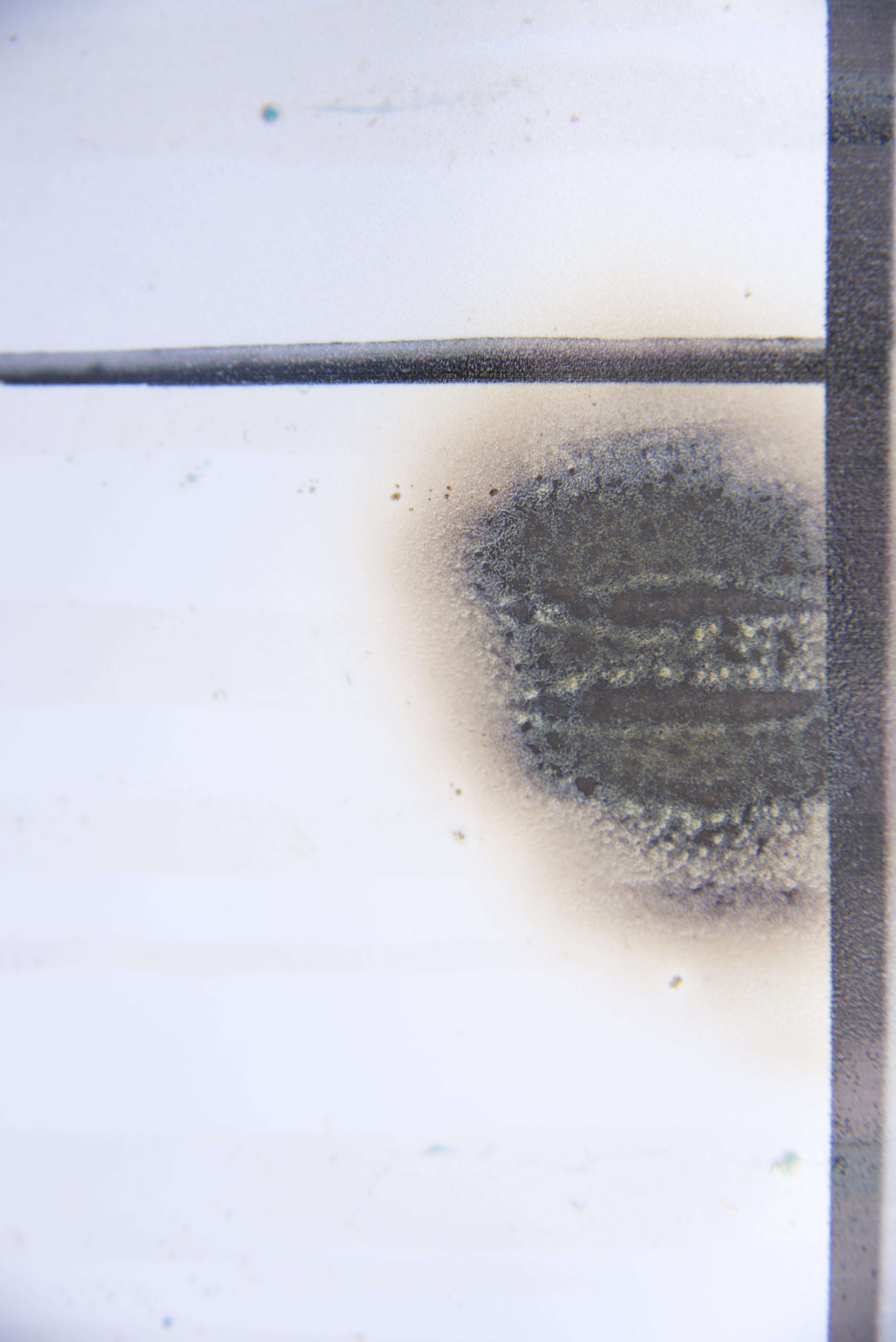
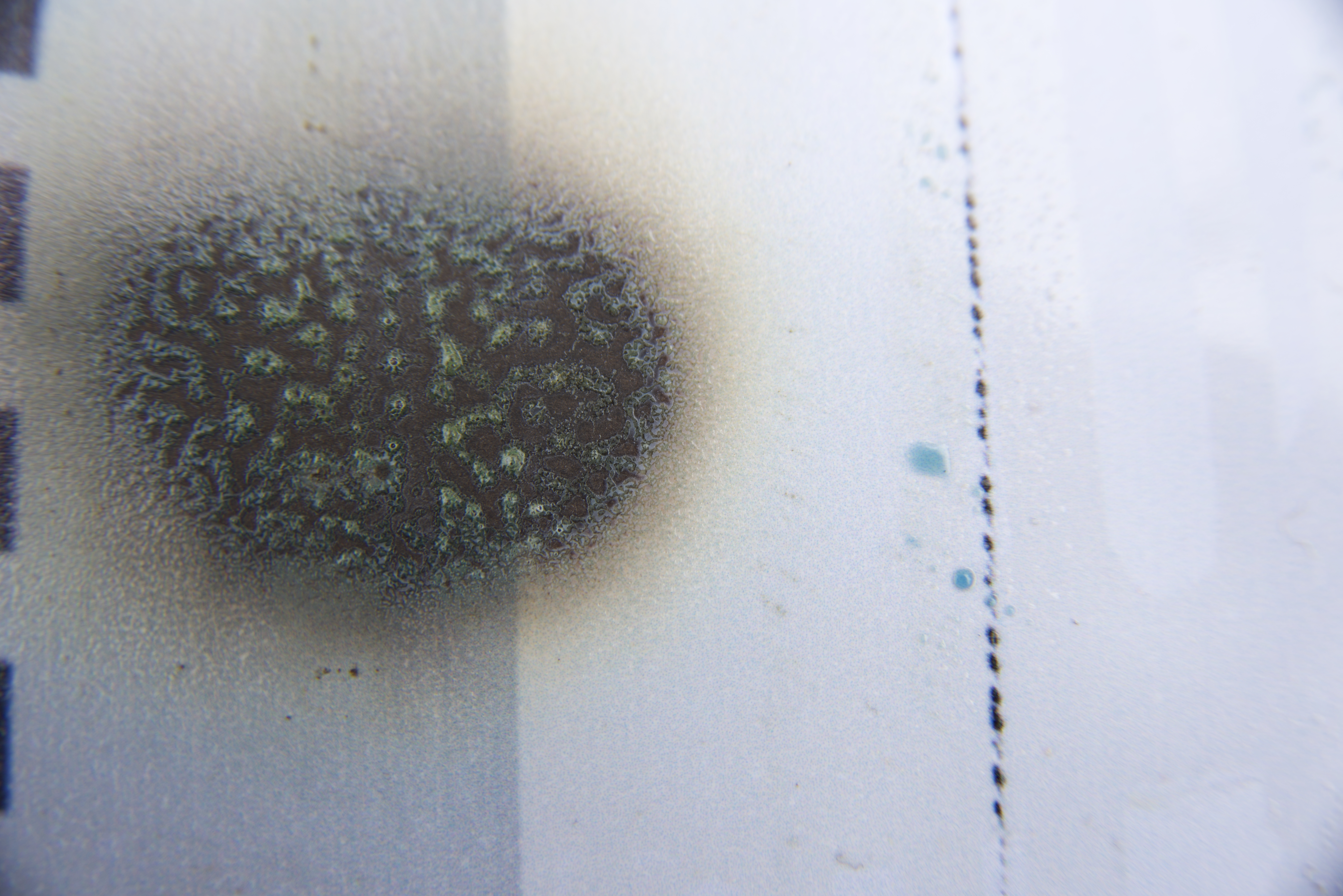
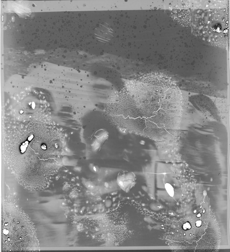
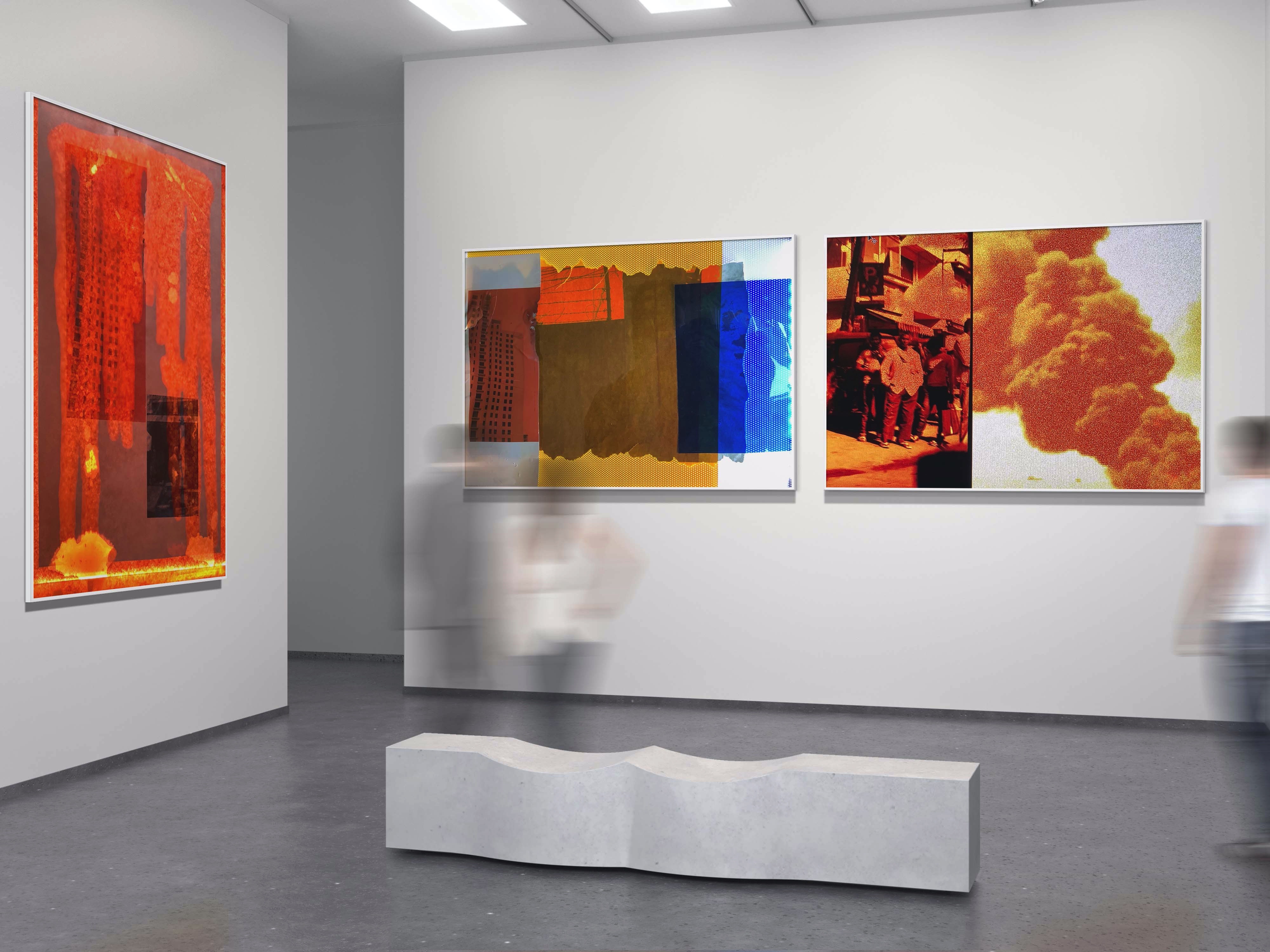
Bit of disappointing tutorial last Thursday and feeling pretty despondent. Despite my enjoyment of the large scale collage process, the resultant feedback was not particularly positive. The positive outcome is that over the past few days I have acknowledged the comments and had time to reflect; collaging all the images together detracts from the individual pieces themselves. So I have picked myself up and this morning, using one of my A2 prints and some engine oil. I pinned it up on the wall and syringed the oil across the top so it would bleed down the image whilst photographing and videoing the process. I photographed both the whole image and also sections. The original image is a composite of two. The paper, being quite smooth, has not absorbed any of the oil yet, although this is changing.
Whilst this was going on I had a Monday tutorial with Karen Knorr who proved to be a very uplifting source of inspiration. Gave me some guidance on other artists that I could draw some inspiration from, discussed possible size of an individual piece; I had originally measured the large collage was 5ft x 4ft and incidentally I am 5ft. 4″ so I thought that this size would be a good starting point. I’m somewhat limited in what I can produce as no idea how long my ink and paper supplies will last due to this Covid-19 lockdown, but will keep going until I am curtailed.
We discussed the work of Susan Weil and Mikey Cuddihy. Weil’s work immediately caught my attention. Below are various works from ‘Parts’; her works are described as defying categorisation; “fracturing the picture plane, deconstructing and reconstructing images. Yet, her works are neither Cubist or Futurist and they elude the boundaries of Abstract Expressionism . Instead her paintings challenge and surprise. They are dynamic and buoyant, playful and pensive.” (Sundaram Tagore). It makes me consider why I seem to confine myself to a certain size and shape and a) size-up to a large scale b) look at breaking out of the shape mould and experiment a bit.

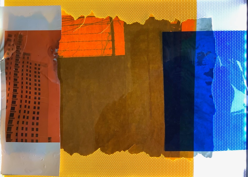
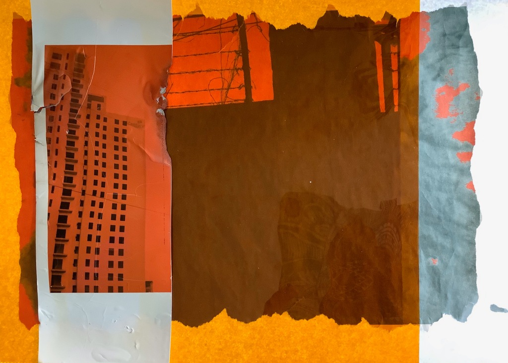
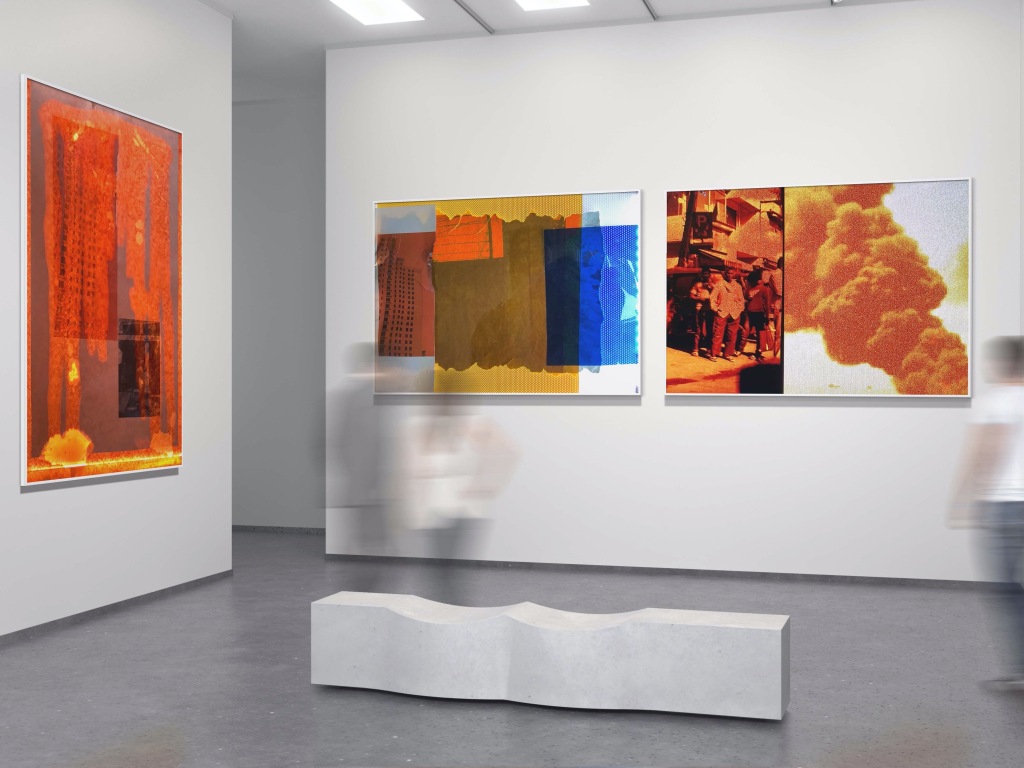
After my tutorial I had a very productive few days, creating 3 new pieces of work from the one I covered in oil. I looked back my interest in the logos for fossil fuel companies; i.e. IndiaOil and have used their colour pantones to work in with a lot of images prior to this and I have continued with this theme.
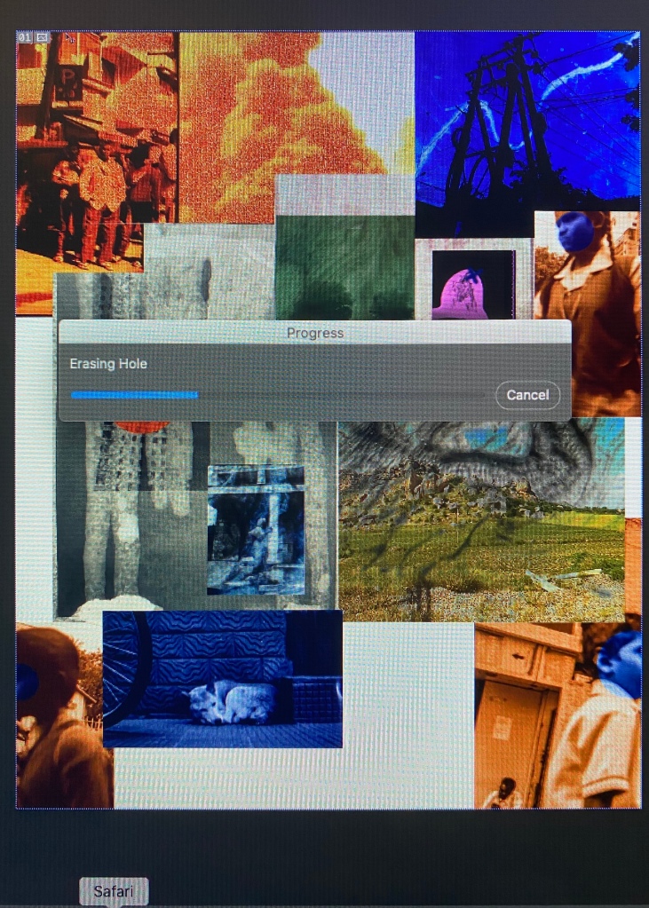
It has now been confirmed that the module will be submitted entirely digitally and we will not be returning to University prior to the hand in date. With that in mind I have been researching how to “exhibit” my work on a large scale format and have found some fantastic resources for this. The one I used, at a small cost, was on http://www.creativemarket.com where there was a great selection of tools for this purpose, any many many others. Below is the one that I chose and is relatively simple to follow on Photoshop. I think they look good and it enforces my thoughts about large-scale printing of the images, when I finally do get to exhibit them. We were to exhibit at Free Range in June with the BA (Hons) Graduates but this has been postponed indefinitely.
W/C March 6 2020
Lockdown week No.3 I have finally entered an Open Call this year! I entered so many last year and had around 8 successful exhibitions in both the UK and Europe. I have felt that this work has not fitted the briefs I’ve researched as my Spitscapes did last year. Maybe its a confidence issue.
This is the brief, although I’m still slightly sceptical as to whether my work is still to abstract for it, but we shall see.
Earth Photo is an innovative competition and exhibition developed jointly by Forestry England and the Royal Geographical Society (with IBG) which reflects the organisations’ common interest in enabling a better understanding of the world around us through our complementary disciplines of the Environment and Geography. Earth Photo will focus on photographs or films which describe one of the following subjects; People, Place, Nature and Changing Forests. We are delighted to announce that for the 2020 exhibition we have a special category; A Climate of Change, to mark COP26, The UN climate change summit in Glasgow in November 2020. Earth Photo invites entries for this new category which enables photographers and film-makers to advance ideas about any dimension of climate change. This work might explore impacts, or efforts to mitigate risks, or to adapt to a changing climate. It might engage with how climate change changes ‘us’.
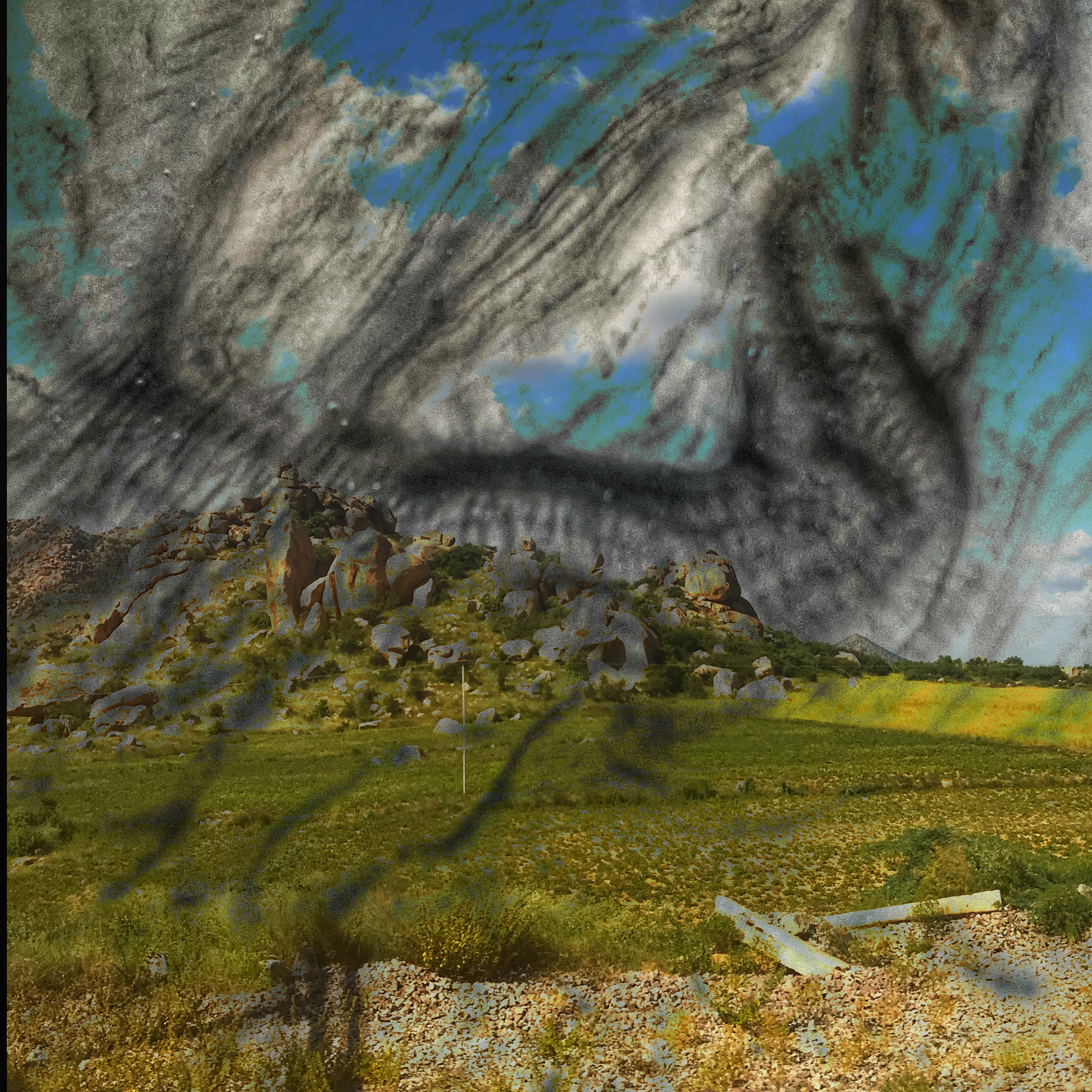
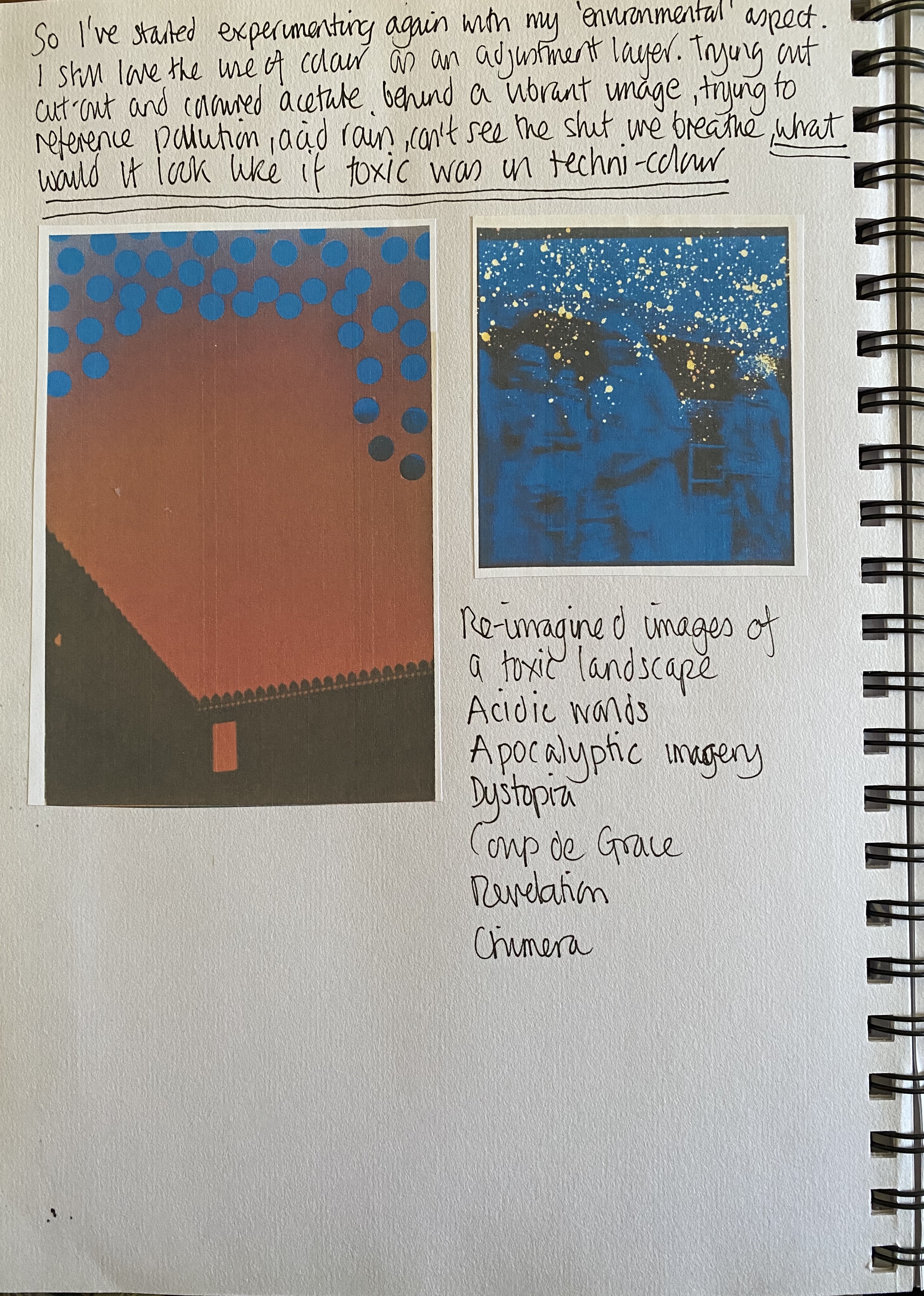
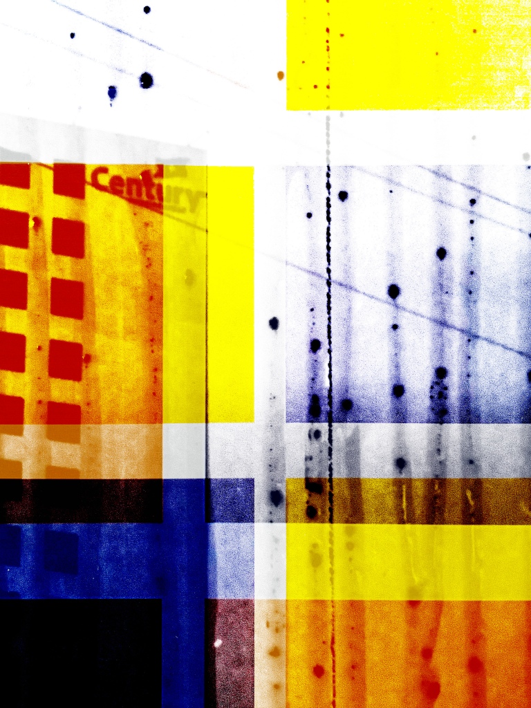
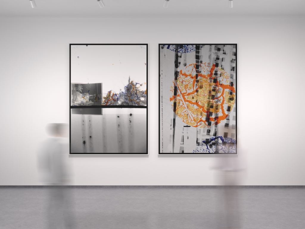
This leads me to my next stage of experimentation. Using the same image (see w/c 30 March; Oil on Paper 1) I got a gas burner and burnt sections of the image and then re-photographed and added to my bank of images until the idea of what use them for were formalised.

Idea formulation: My thoughts on this competition made me imagine how the worlds atmosphere must have altered dramatically since many of us ‘downed tools’. I have driven my car once in 4 weeks and my husband is the same. We have walked and walked, discovered, enjoyed, its like retirement! I started working on how to conceptualise my thoughts of the then and now, using diptychs; burning, inverting, layering. Thus producing the images below, Re-imagining the Then and Now. I’m fairly pleased with the outcome as I believe it reflects current climates and a reaction to the situation we find ourselves in, it’s reactive work.


When I start experimenting I feel encouraged when the results are positive, who wouldn’t?! I know I’ve mentioned the positives of tutorials and group critiques when others offer artists to consider or books to read, websites to consider, it provides you with a wealth of research; Karen Knorr introduced me to Yves Klein in a recent tutorial.
W/C April 13 2020
Lockdown week No.4 I have been painting this week and I found a new fascination; when you put paint brushes in white spirit the paint and spirit swirl and clash around in the most mesmerising fashion so I just had to video it and also use them for images to make test prints. Not entirely sure if they will be used but I have them in the ‘bank’ for future use.

https://drive.google.com/open?id=1JqzCVsbnXypRta0UXCP3w4QwaOv2msfz The video is not being utilised and is here for context. I don’t think it fits
I recently soaked a print on normal photopaper in engine oil and burnt sections but I now want to see how light sensitive paper would react when burnt. I have no dark room facilities at the moment to create a print so printed an image on to a sheet of acetate and used the sun to print it onto the paper. It’s not the strongest image but it worked enough to experiment with. I didn’t soak it in oil and just turned the blow torch to see how it reacted, it was pretty impressive without any accelerant, it reminded me of the research regarding Chino Otsuka (Deep Fried) frying negatives (see earlier blog entry). The destruction is just what I was hoping for. I am using this image already in one of my final pieces so this being experimental version I will select a different one, although I am playing around with diptychs, triptychs et al.
W/C April 20 2020
Monday started with a tutorial with Karen Knorr. We discussed various artists to look at and ones already researched listed on this blog; Gustav Metzger, Chino Otsuka, Baldessari, Helen Chadick and then others that may be of interest; New Realist Nikki Saint Phalle / Yves Klein, Lucio Fontana (The End of God), and Aliki Braine. We also discussed scale of the work. I have been test printing at home using the poster settings in Adobe whereby it can print any size image using A4 sheets, for example the one I recently printed used 12 A4 sheets of paper, I then pinned them to the wall to get a sense of scale. I was keen to print it the size of myself, 5ft 4in. The thought process of this is that much of my previous work has been about my health and I think this still fits into the environmental poisoning aspect of the work, i.e. we can’t see what affects our health; long term or short term. The use of global products that corporations and ourselves use; seeping into the water, the air we breathe, the earth we plant in, the animals we eat, its all consuming and there is no hiding. This damage has been millennia’s in the making and despite the drumbeat of the “New World Order” about Climate Change the damage still rampages on and we merely pay lip service to resolutions, but there is no sense of urgency despite growing evidence.
Looking at the artist Yves Klein, the author of many works including the International Klein Blue (IKB) his work Fire Painting was one that caught my attention.
By choosing to express feeling rather than figurative form, Yves Klein moved beyond ideas of artistic representation, conceiving the work of art instead as a trace of communication between the artist and the world; invisible truth made visible. His works, he said, were to be ‘the ashes of his art’, traces of that which the eye could not see.
Yves Klein’s practice revealed of new way of conceptualising the role of the artist, conceiving his whole life as an artwork. ‘Art is everywhere that the artist goes’, he once declared. According to him, beauty existed everywhere, but in a state of invisibility. His task was to capture beauty wherever it might be found, in matter as in air. Unfortunately, like Helen Chadwick, he was another great figure in the art world who died prematurely at the age of 34.
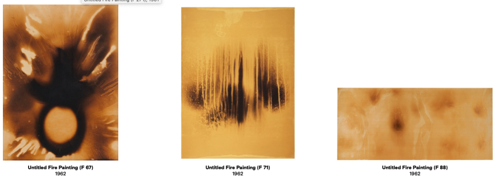

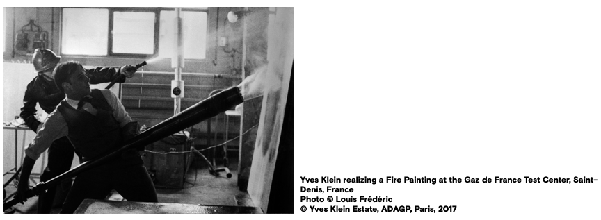
When I think of my fire tool, a gas weed killer wand, this absolutely pales into insignificance when I see what Klein used. Unfortunately I don’t have the facilities or the use of a fireman to enlarge my process. I found the process of using naked flames quite an anxious experience, also rather exciting. Maybe it’s trying to control something that could easily be devastating or get out of my control that is appealing or challenging. I was very hesitant in my burning processes and remember getting rather scared when the flames took hold, then trying to blow them out. You have to be prepared to lose an element of precision, if not then it may not to well for a well ordered mind! It is a way of working that I do enjoy, pleasure in the unexpected.
W/C April 27 2020
As we are all approaching the end of the course I decided to make a start on my evaluation of this module. I had two outcomes I considered achievable:
- Personal response to place
Aim: To describe my personal response to my three-month experience travelling in India using image and text in a diaristic manner.
Objectives
- Research diary projects
- Research the use of text and images together and subsequently;
- Experiment with text
- Translate diary text and edit to fit the project
- Edit images
- Test design in the form of a book
- Test the design in the form of a newspaper/zine style publication
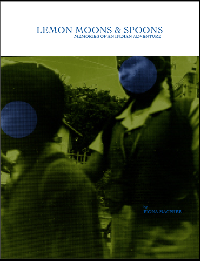
I started to design the diary using a template in InDesign. I find it very difficult to name my projects so as a starting point I referred to my diary entries to try and locate a suitable phrase or sentence. Any early entry mentions the shape of the moon looking like a lemon as it was lit from below. Being in the Southern hemisphere the moon has a different vantage to that we see in the Northern. I tried to buy a knife to eat with but none of the shops sold them, all they had were spoons. This was a first attempt at a name and the more I read it over the more I tend to feel that it fits, its slightly ambiguous but appropriate.


As part of the evaluation process its important to explain any changes of direction from your original proposal. Working on two projects came with some issues and my focus came to intensify on the second body of work. After discussions at tutorials I came to the decision to place this project on hold until such time I could devote all my time to it as it deserves more contemplation and editing. My second project was becoming increasingly elevated with an outcome that would produce the strongest body of work. Whilst I achieved the initial objectives the project remains embryonic at this current time.
The second outcome is the one I have moved forward with.
- Socio-political conditions related to environmental hazards and poisoning
Aim: To use my images to visualise the environmental impact that pollution has on humanity, the atmosphere, even beyond our planet.
Objectives:
- Research types of pollution; there are many
- Research pollution and polluters from credible sources
- Decide whether it’s about India or make it more abstract
- Experiment with polluting images, negatives, paper with pollutants
- Produce a body of work that recognises the decisions made
May 4 2020
Climate change and environmental poisoning has been written about for a long time. I had no idea how long until I started to read Silent Spring by Rachel Carson written in 1962. The book brought to public attention the controversial use of pesticides and other chemical pollution, that led to a turning point in legislation in the form of the U.S. Clean Water Act and the banning of DDT in many countries throughout the world.
Starting the book off describing a town of utopian standards, with an abundance of wealth, fertile land, nature pulsating through its very core. Then upsets the imageries by entering into the target of the story, extensive use of pesticides, “when a strange blight crept over the area” (Carson 2), the town becoming soundless and dead. It goes on in great detail about the contamination of air, earth, rivers and seas by using dangerous materials over long and even short periods of time.
She is certainly not without criticism in her campaign to highlight the misuse of pesticides. British politician Dick Taverene wrote, “The anti-DDT campaign that she inspired was responsible for almost as many deaths as some of the worst dictators of the last century”. The argument was that DDT was a necessary chemical in the prevention of mosquito-borne disease and to increase the harvests of developing nations.
A poem printed on an information packet from the National Pest Control;
“Hunger, hunger, are you listening ,
To the words from Rachel’s pen?
Words which taken at face value,
Place lives of birds ‘bove those of men.“
The argument for Carson’s three environmental ethics“preserve human health! respect the moral considerability of non-human beings! promote human happiness and flourishing!” could be an argument for the use of DDT if you were to assume that it a) preserves human health and b) without health you cannot promote human happiness and flourishing, which is all OK if you don’t give a damn about nature; “The balance of nature is not a status quo, it is fluid, ever shifting, in a constant state of adjustment. Man, too, is part of this balance (Carson 218).”
The cost of progress and prosperity, the health of others, these are difficult decisions.
These books make for thoroughly depressing reading matter and should, for sake of my sanity, be read in small doses.
All countries have different pollution problems. Whilst in India I visited Delhi and the surrounding areas the pollution was at catastrophic levels which were primarily caused by the burning of crop stubble to make way for wheat. The practice was banned when the pollution became impossible to ignore and contributed to 50% of Delhi’s pollution. It is cheap for the farmers to use this method as the alternatives of machines undertaking the process is to expensive but many still flout the law. The farmers feel demonised and unsupported by the government who expect them to pay for expensive equipment whist offering no subsidies or financial incentives in methods to reduce pollution. This supports my thoughts on how can people actually make any contribution to the drumbeat of the West on climate change when their world is eeking out a living from the bare minimum, are they bothered as long as they can provide for their families, I doubt it.
May 11 2020
This last week I have been compiling all my images into one catalogue for submission. We had an online InDesign lesson last week, which was informative and learning was on the agenda! I’m self taught on my limited InDesign skills so learning something is always a positive. Beytan showed us how to set up a portfolio, best settings for online publishing, EPUB interactivity, buttons and hyper-links, etc. My catalogue is quite basic and I thought I would attempt to add an index of images at the back using the button procedure we had learnt. It initially started off with a list, which looked quite comprehensive but just a bit dull. I did a little research for ideas and came across some shaped thumbnails. I was quite keen to use a circular shape as I have used it throughout a majority of my work, connoting life and the future no less.
I considered the hexagonal shape seeing as I have been looking at the chemical compounds of oil, petroleum and our everyday beauty products. These seem to be too obvious a choice.
Below is the first attempt at an index. I didn’t want to put a contents page in at the beginning as for me it disturbed the flow of the beginning and its a catalogue not a book.
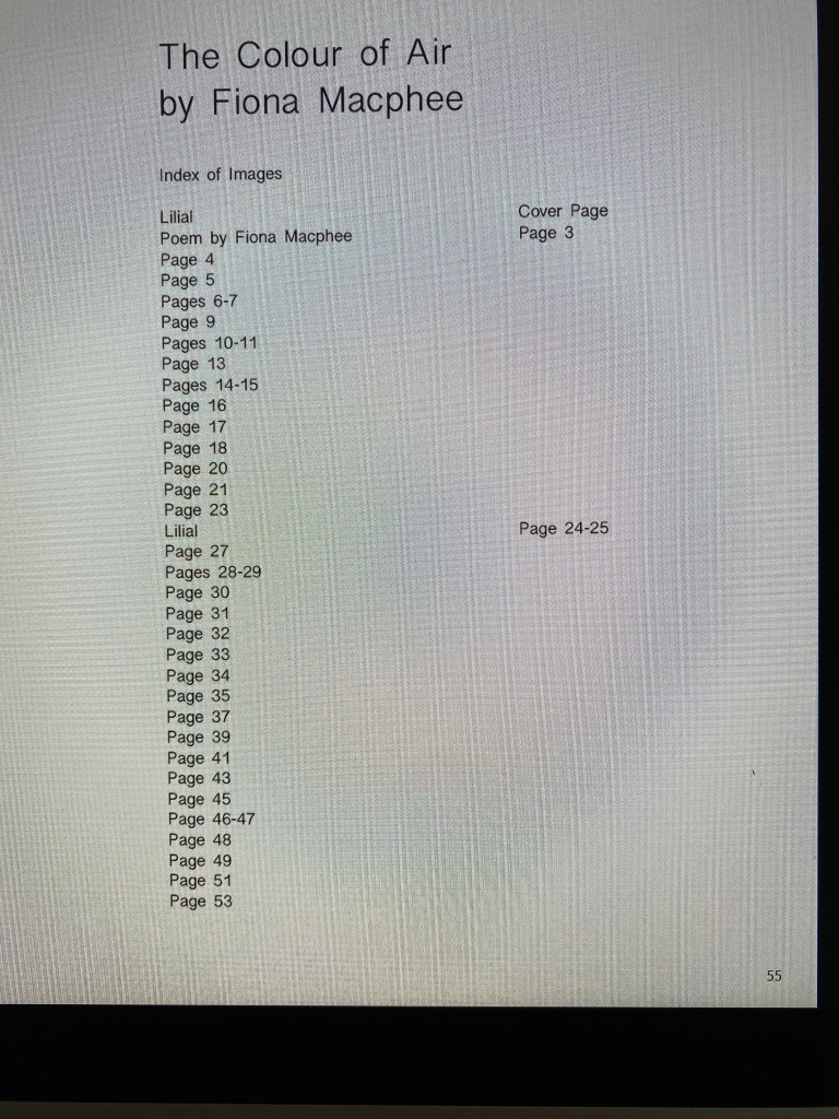
I decided to go with the circular thumbnail, the design looked much more stylish, references/links to the work and fits the more interactive element of the page. It’s just a case of clicking on the thumbnail and it takes you to the image. I also picked out a colour from the previous image to use as a background colour for this page in order to introduce a better flow.
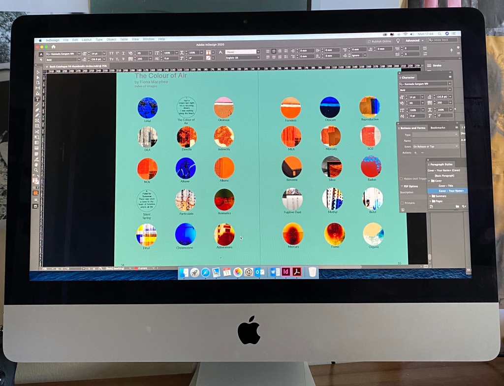
As you can see all the images have names. When I was researching the chemicals that were in fossil fuels and those that are used in deodorants, skin/sun cream, moisturisers, make up, the damage they could potentially inflict on the bodies of humans, and animals, is truly terrifying. I remember when I was recovering from breast cancer (2017) I bought an aluminium/paraben free deodorant as I remembered reading several years before about a link between deodorant and breast cancer, but guess what, it didn’t really work. Further reading reveals that there is no scientific link, although it’s reported that parabens mimic the activity of estrogen, which promotes the growth of cancer cells and they are found in breast tumours (information obtained from http://www.cancer.gov).
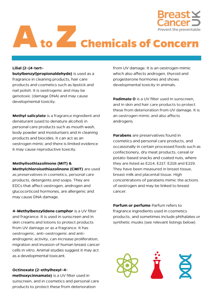
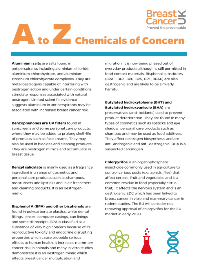
Whilst looking at Breast Cancer UK they had a very informative A-Z of Chemicals of Concern, you will be truly concerned after reading it. Despite this I decided to use some of the names, ingredients and descriptions to give titles to my images. (https://cdn.breastcanceruk.org.uk/uploads/2019/09/A-to-Z-Chemicals-of-Concern-Web.pdf). There are too many to go into detail but this link is very interesting and lists all those currently of concern. I don’t want in any way to lessen the harmfulness of what I have chosen and have selected them carefully but there are some that are defined quite beautifully; Fugitive Dust is an excellent term.

This is taken from environmental news site EcoWatch where I have referenced the term “fugitive dust”. https://www.ecowatch.com/10-most-toxic-ingredients-used-in-coal-oil-and-gas-production-1881837429.html
4. Petroleum Coke (Pet Coke)
Fossil Fuel Source: Oil (particularly tar sands bitumen)
Pet coke is an increasingly abundant by-product of tar sands bitumen oil processing. It is a heavy dust which resembles coal. It contains dozens of dangerous chemicals and heavy metals, including chromium, vanadium, sulfur and selenium. Research on its risks to public health have been scant; the little research so far is inconclusive. As explained by Chris Weisener, a researcher at the University of Windsor: “there is not much information about pet coke available, so its effects are not conclusively known.”
Does, in fact, pet coke represent a public health threat?
“From the air perspective, as long as it’s not being burned, the only concern would be fugitive dust,” said Chris Ethridge of the Michigan Department of Environmental Quality. (As if “fugitive dust”—laced with toxins—would be perfectly harmless floating freely in the air.)
Below is a excerpt from a list from Breast Cancer UK.
Exhibition and printing developments
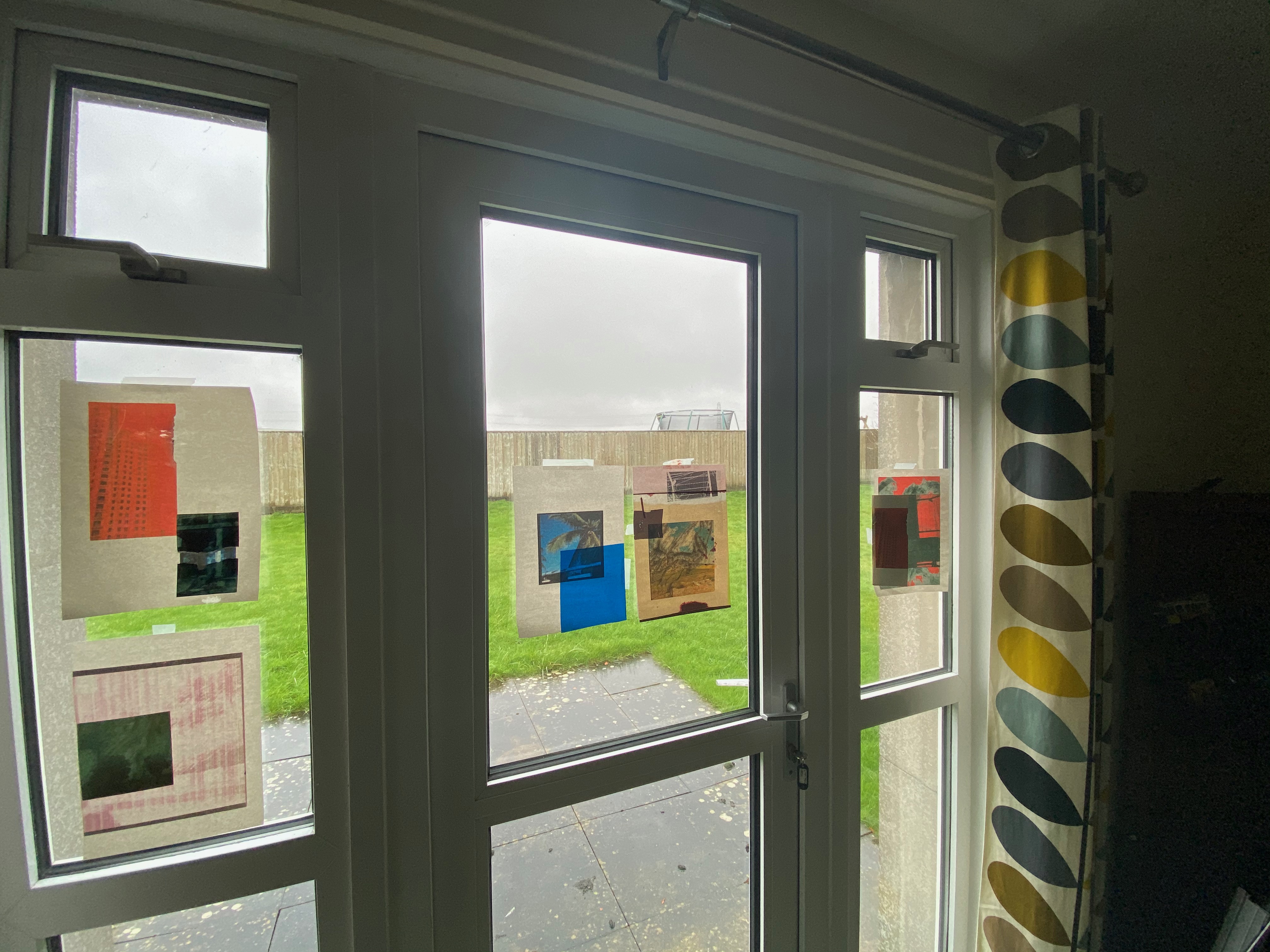
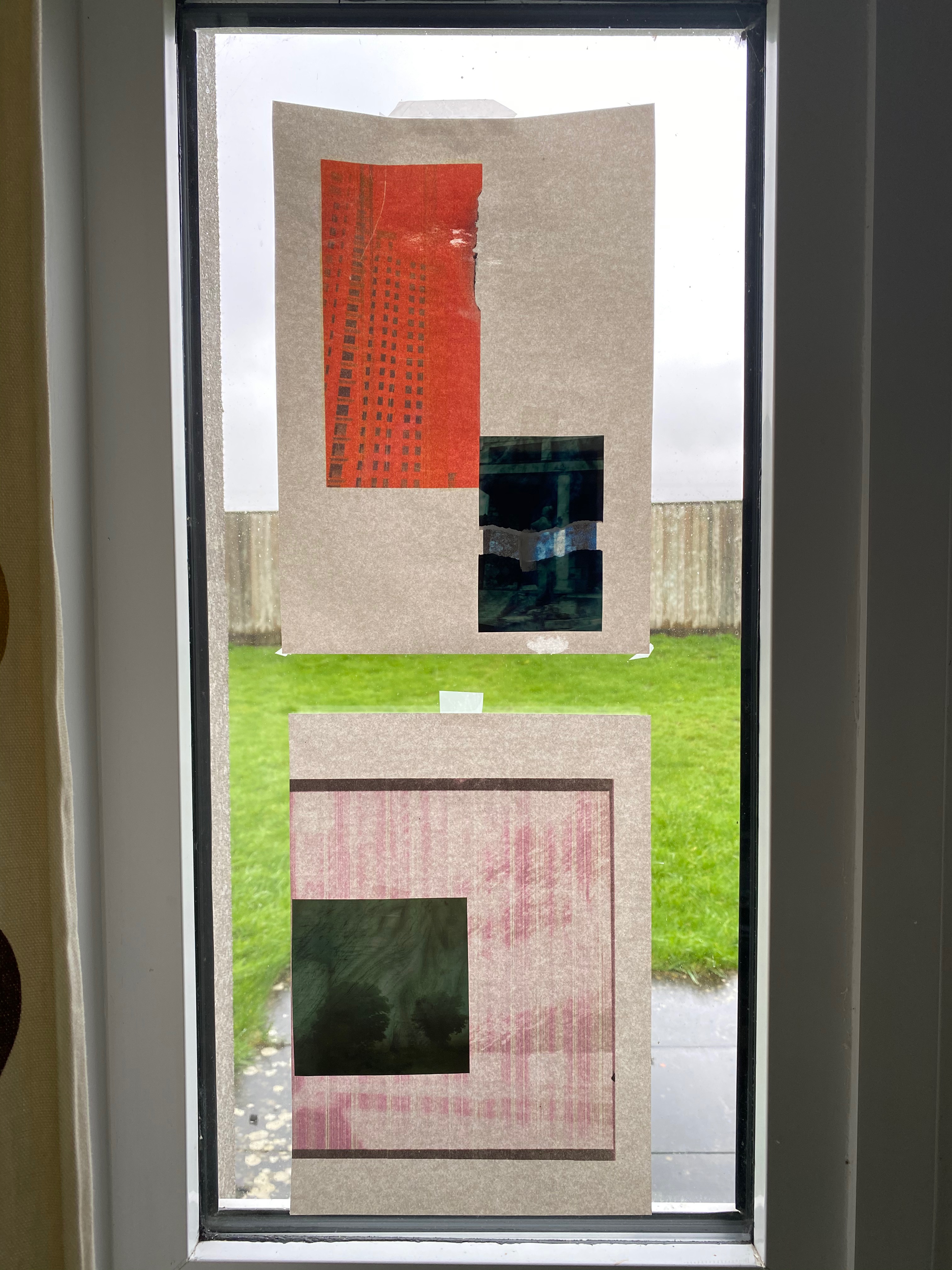
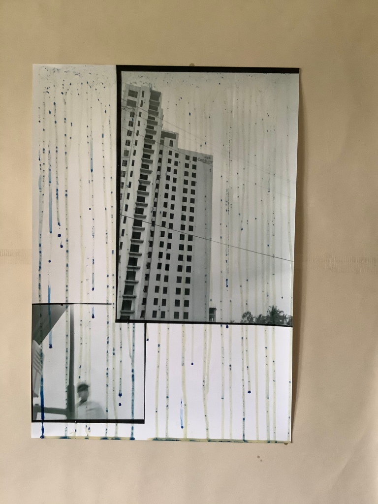
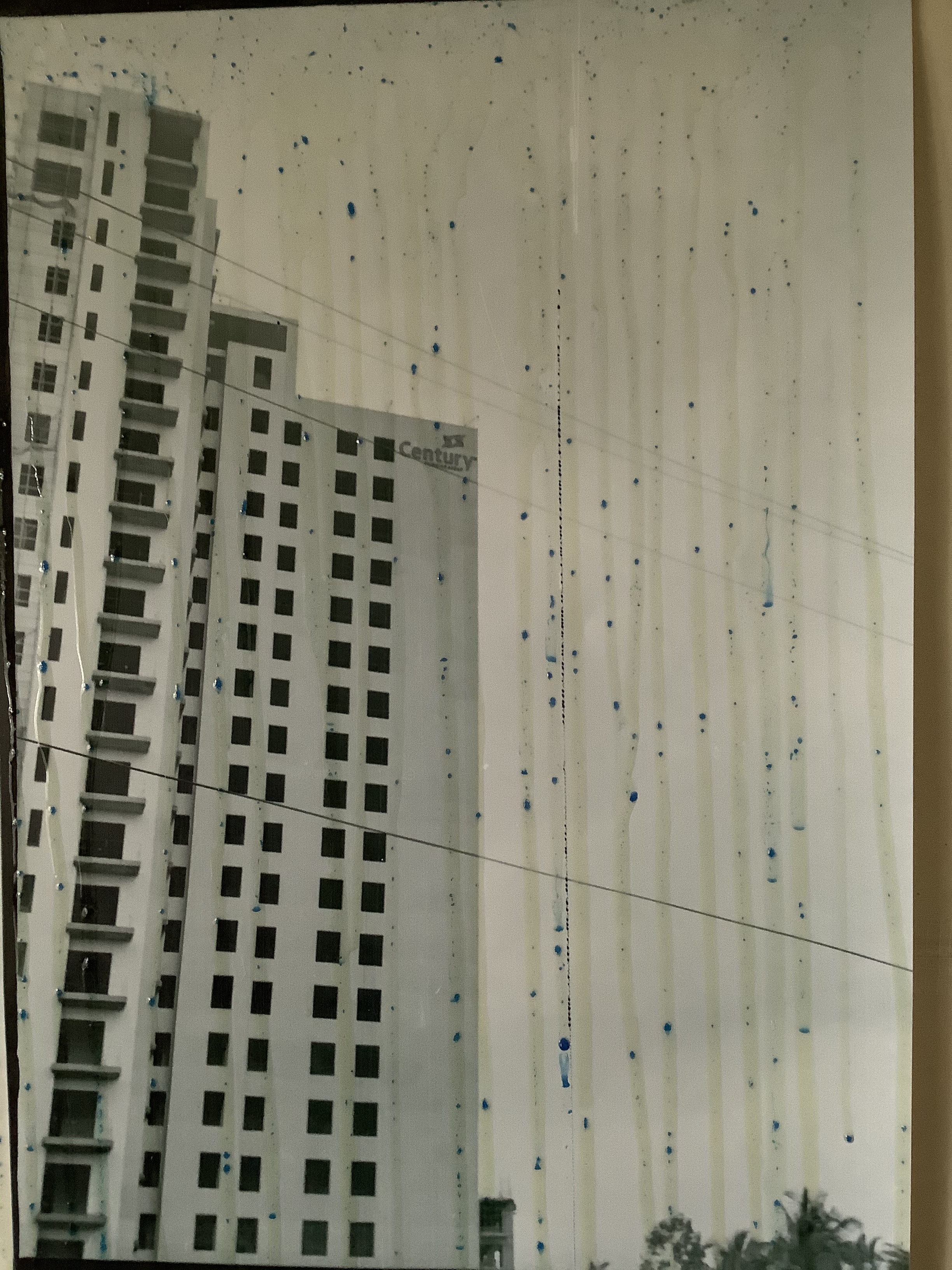
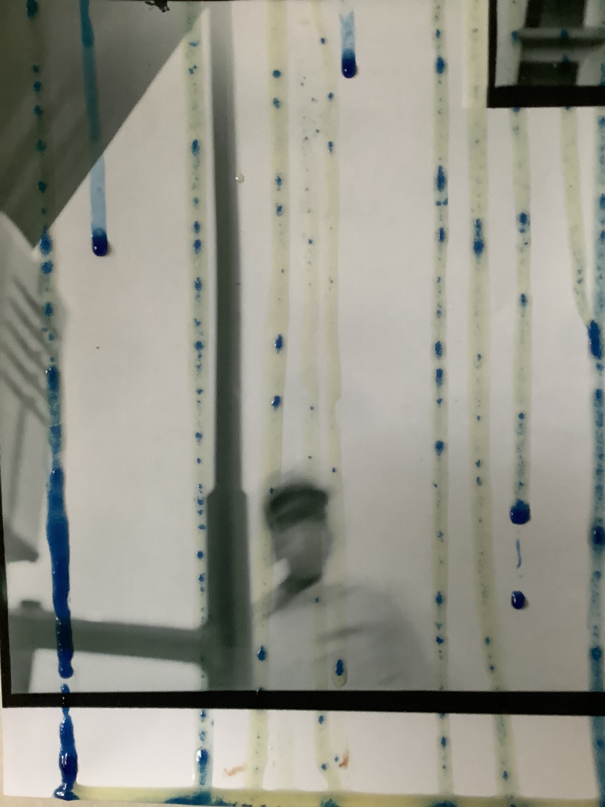
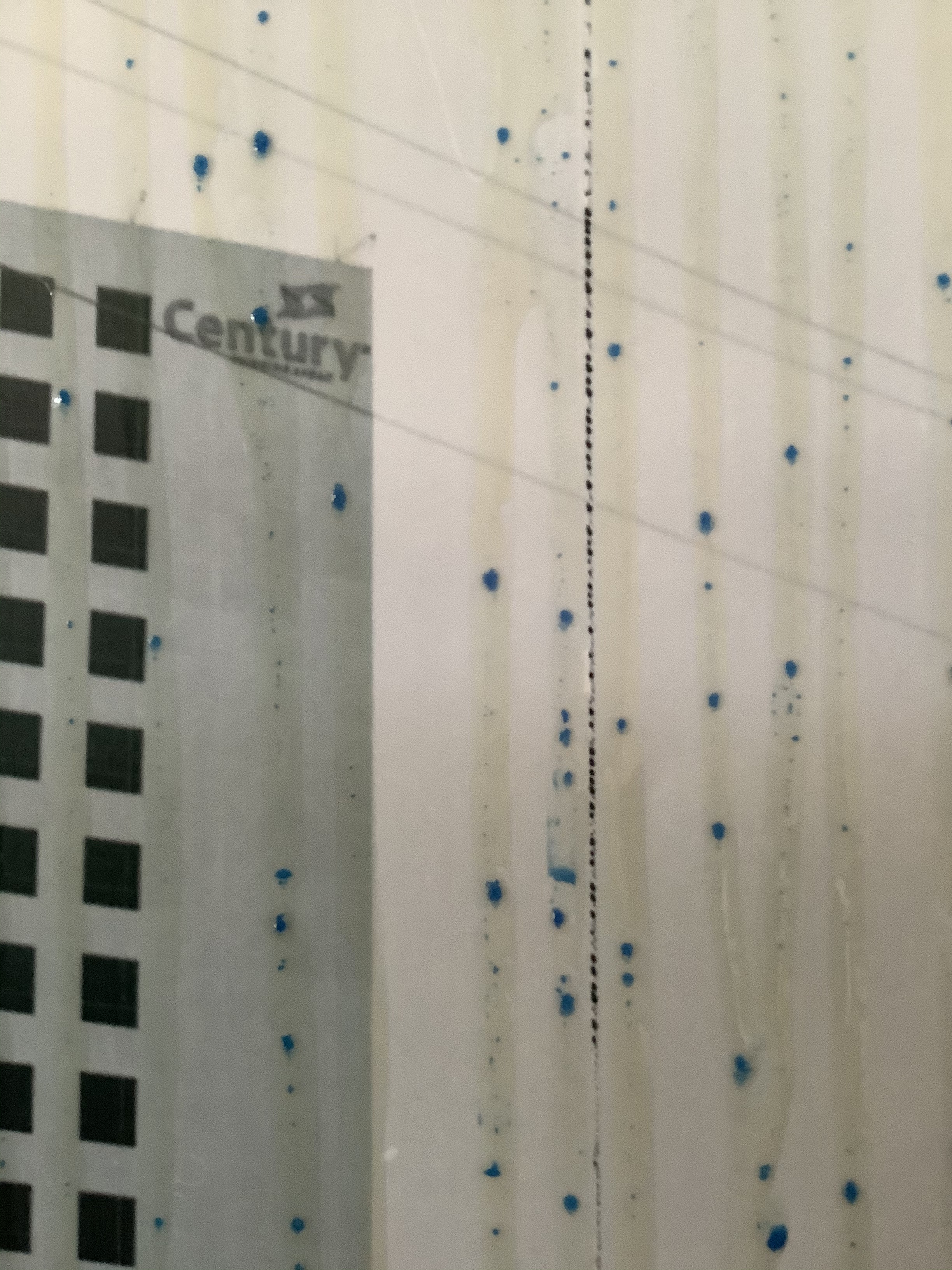
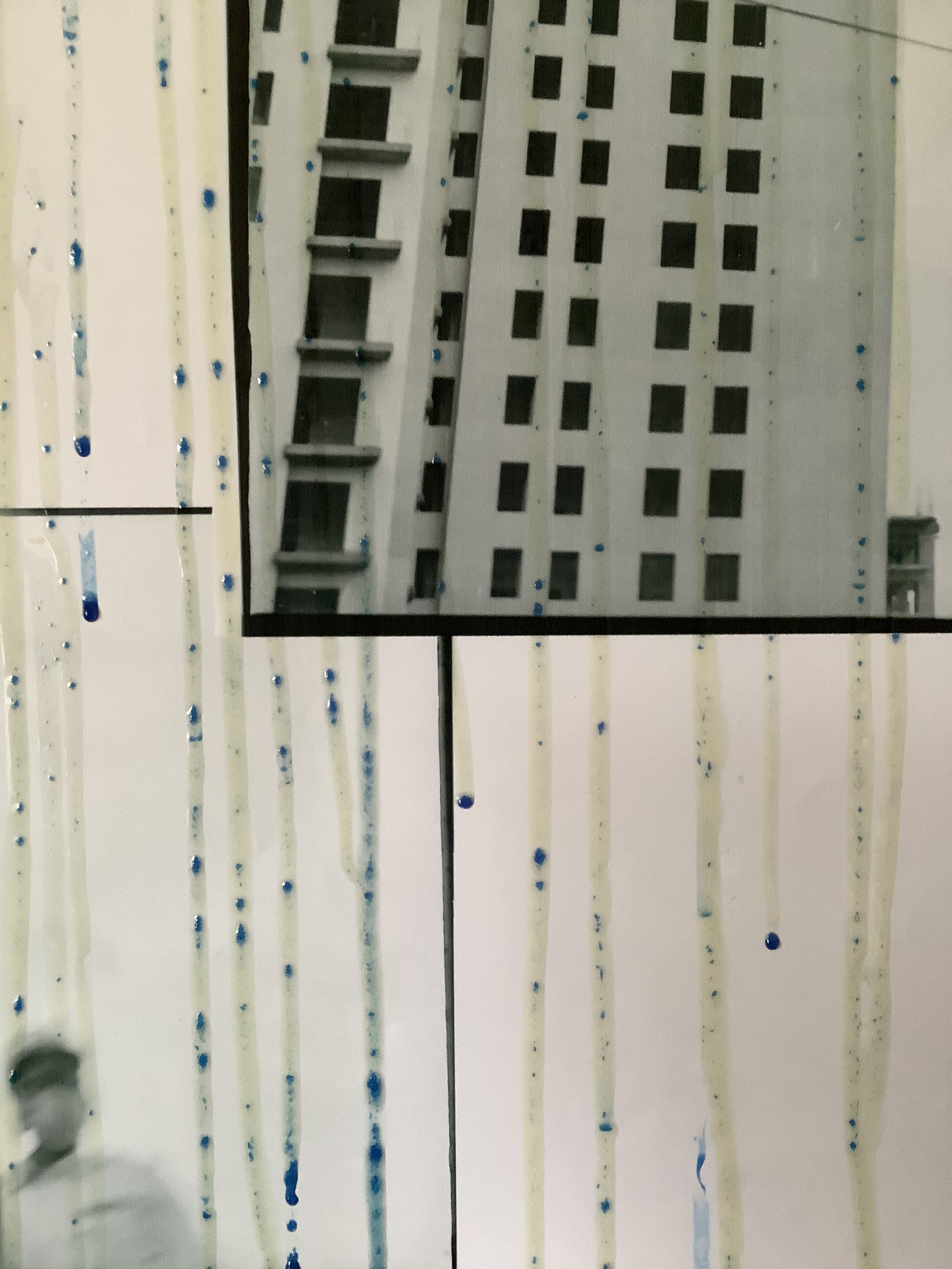
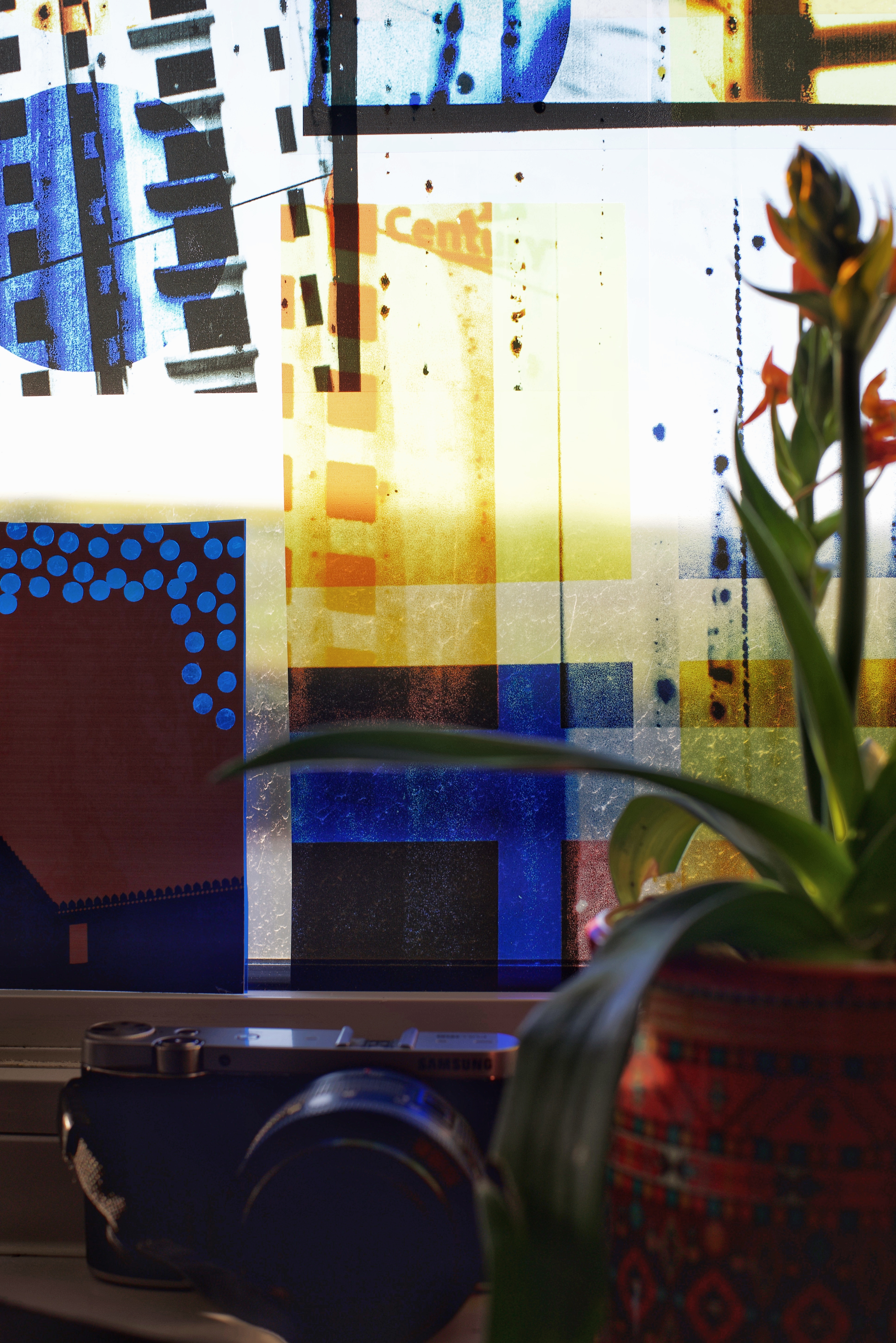
As we are not holding the exhibition UCA or at Free Range, it’s postponed for obvious reasons, there are plans for an online exhibition but there is nothing quite the same as seeing work in the flesh. I have been printing my work on newspaper print and cheap A3 sketch paper as I think its suits the project. Ori Gerscht commented once “its no Hanhemuhle glossy book project”! I completely understood the comment though, if it’s all about pollution and poisoning why would it be on pristine white paper. I have stuck with the newsprint throughout the project and I have also tried printing on acetate, as when the lightweight paper was held up to the window light it gives off a glow, which intimates toxicity. A lightbox would have been something to try, but I have not had the opportunity yet to test this. I have tried more exhibition mock ups, see below.


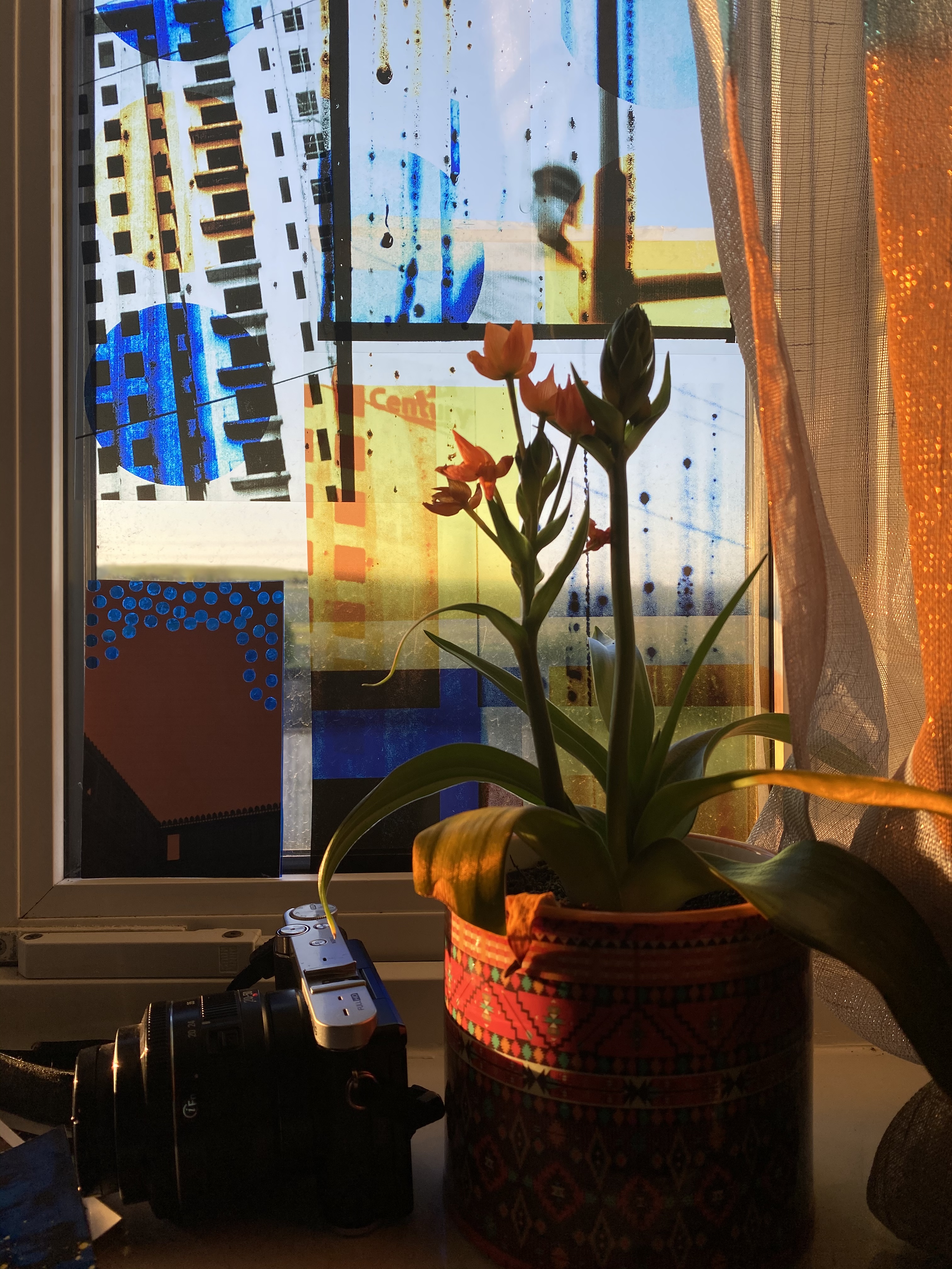
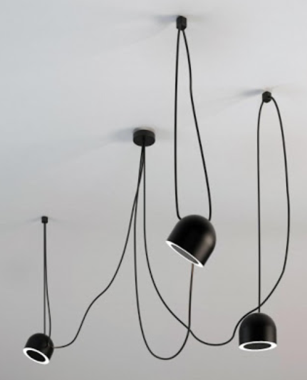
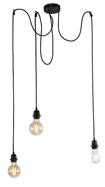
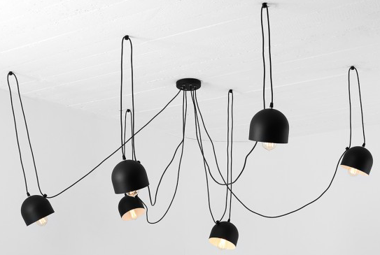
I entered an online Instagram competition to show solidarity by way of a window serenade. I used the acetates that I had test printed and taped them to the window. It gives you a sense of how they may have looked if lit from behind. I was considering the light boxes but another thought was just to have industrial looking lightbulbs behind large hanging acetate, or possibly thin architect paper images, say from a ceiling or at least a good height up, this may be a consideration for Free Range.
In India there are cable wires everywhere, they all seem to be precariously placed on roads and buildings, it’s like there are masses of black snakes protruding out from any little nook. So I quite like the idea of the current trend of having bulbs that hang out like a spider suspension from one central point. It would be great to introduce that all encompassing noise of horns, cars, dogs, drumbeats, shouting into it, unless you have been to India or similar places you just cannot fathom that anywhere could possibly be so noisy all the time.
Until such time as this can be tested out in any form I will just use my imagination and maybe plan for a future exhibition when Free Range happens for us.
Tomorrow we hand in our final major projects and that’s our two year MFA Photography complete. It’s a bit of a sad end really, we’ve not seen each other since early March and it’s a possibility that we may never see some of our fellow students again. It’s been a fantastic two years and I honestly can say that my 3 months in India towards the end of last year has changed my life. I have so, so many amazing memories to hold close to my heart, even closer now as it seems such a long time ago when life was normal. It seems inconceivable that we will return to “normal” soon, at least not this year. It’s been such a surreal few months. Good luck to all my lovely fellow students and wonderful tutors, I wish you all the very best.
I feel that the work I have produced over the last few months has subconsciously been visualising this crisis and what it means, particularly mentally and how it’s affected our thoughts for the future, a very different one.
Blog is continuing, please do come back for regular updates. Last update 12 May 2020.
Research references
Books
Bonneuil, C. and Fressoz, J. (n.d.). The shock of the Anthropocene. preface xiii.
Braidotti, R. and Hlavajova, M. (n.d.). Posthuman glossary. p.65.
Carson, R., n.d. Silent Spring.
Demos, T. (2017). Against the Anthropocene. Berlin: Sternberg Press.
Eugene Huzar, L’Arbre de la Science, Paris: Dentu, 1857, 106.
Fusco, P. and Mailer, N. (2000). RFK Funeral Train by Paul Fusco. New York: Magnum Photos.
Haraway, D. (2016). Staying with the trouble. 1st ed. Duke University Press, p.100.
Kerouac, J. and Donaldson, S. (1979). On the road. New York: Penguin Books.
Lewis, S. and Maslin, M., 2019. The Human Planet: How We Created The Anthropocene. 1st ed. Pelican.
Merchant, C., 2019. The Death Of Nature. New York: HarperOne.
Wallace-Wells, D., 2019. The Uninhabitable Earth. 1st ed. Penguin.
Websites
Anthropocene-curriculum.org. (2019). Anthropocene Curriculum. [online] Available at: https://www.anthropocene-curriculum.org
http://bloomsburyacademic.libsyn.com/website Christopher Schaberg interview on his new book Searching for the Anthropocene
Interni Magazine. (2019). Welcome to the Anthropocene – Interni Magazine. [online] Available at: http://www.internimagazine.com/projects/welcome-to-the-anthropocene/
Home
https://www.newspaperclub.com/
https://www.photopedagogy.com/
https://vimeo.com/251618816 Talk by T G Demos on his book ‘Against the Anthropocene’
https://waqi.info/#/c/13.159/77.718/10.9z
Welt, H. (2019). Haus der Kulturen der Welt. [online] HKW. Available at: https://hkw.de/en/hkw/ueberuns/Ueber_uns.php
Artists
https://www.aaronschuman.com/slantpages/slant01.html SLANT
https://chino.co.uk/gallery/deepfried/friedpage1.htm
https://mikeycuddihy.co.uk/mikeycuddihyart2.html#raising RAISING THE ROOF
https://www.sophiegabriellephoto.com WORRY FOR THE FRUIT
http://www.susanweil.com/Susan_Weil/Black_Square.html PARTS
http://www.yvesklein.com/en/oeuvres/serie/10/fire-paintings/?of=2 FIRE PAINTINGS
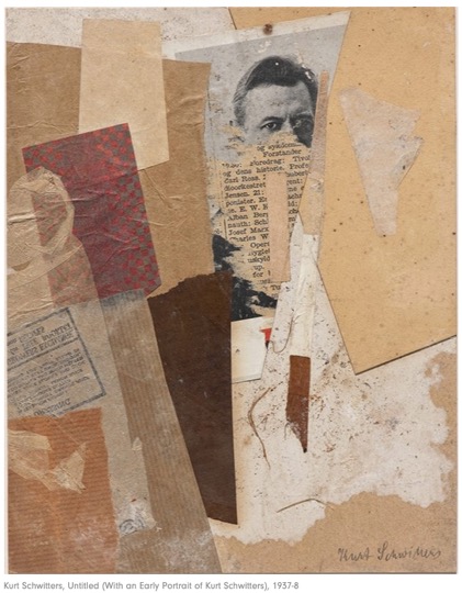
Helen Chadwick Hannah Höch Kurt Schwitters
Nancy Spero John Stezaker Walid Raad
Dadaism / Photomontage / Collage
Professional Development update April 2020
PGCE
I have been accepted for an Art & Design (Secondary) PGCE programme in conjunction with Bath University and a school local to my area to commence in September 2020.
The School Direct is a school-led initial teacher training (ITT) programme; it provides a great experience if you want to train and learn ‘on the job’. The School Direct route will be hands-on in the classroom and at the university.
Access to an academic programme of study at Bath Spa University which will support you to understand the theory behind teaching whilst developing and practicing your skills in school.
For my interview I had to prepare and deliver a 15 minute lesson on Natural Form to eight Yr.7 students. I researched the current curriculum and used a wealth of teacher training resources that are available online. I used the artist Yayoi Kusama as the base of the lesson. At home, using my microscope, I photographed several different types of leaves and flowers and printed them out, I also had the actual objects themselves in the lesson. I introduced the items to the students and asked them to look at the photographs and observe the symmetry and also to pick up the flowers and leaves to feel them. The textures were quite different and I asked them to think of descriptive words that could be used. I then showed them the work of Kusama and explained briefly how she uses symmetry in her work. Finally, pens were provided and a template of a leaf was handed out and I asked them to design their leaf in the style of Kusuma. When they had finished we put all the photos in a line to form a trunk and then they added their leaves to form a tree. It went really well, the students engaged and my objectives were achieved. I received some very positive feedback, more importantly though, I thoroughly enjoyed it and felt that I have chosen the right school and the right direction of a career in teaching. I was offered a conditional place that afternoon. I need to sit my Maths Equivalency Exam for which I am currently studying via GCSE text books and will be hoping to sit an exam June/July, but this is now dependent on the Covid-19 situation. Bath have stated that the exam could be sat at their institution if necessary if the providers of the Equivalency Tests are unable to open come September.
TALKS
University Centre Farnborough have asked me to give a 30-minute talk to Year 2 ED Photography, Art & Design students in a bid to encourage them to go on to study HE courses. I will present my experiences on my work placements, which modules I found more interesting and general thoughts on my degree experience, and also what I have been doing post-degree. To get the opportunity to talk to an audience is exciting and also tremendous practical experience to be able to gain confidence and improve on articulation skills for public speaking.
COMPETITIONS/EXHIBITIONS
Competition entries are not as prolific as last year but I have recently submitted 10 images for Earth Photo run in conjunction with Royal Geographical Society, found through subscription to Parker Harris newsletter.
I submitted for the Lightbox again this year and will continue to monitor and enter into exhibitions using similar websites as I did in the second semester. Curator Space was my most successful use of gaining experience and exposure to the exhibition environment and meeting other artists. There is a great deal to learn in talking, sharing and gaining ideas from others regardless of their discipline. It gave me the opportunity to get as involved as little or as much as I would prefer, although I found that it gave me very little by way of control of the display of my work. It was by and large successful but not always. Having spent 3 months on the student exchange with Srishti Institute of Art & Design in India I am keen to look at an artist in residence position in the future.
Sites with relevant information;
https://thecuratorship.wordpress.com
http://fastforward.photography/opportunities
Produce a print and online portfolio for review, possibly in Arles, Format Festival, The Curator Ship lists worldwide review opportunities. I have booked flights and accommodation to Arles 2020.
My website www.fionamacphee.photography is still ongoing and a work in progress, it was reviewed last semester but to get the input of an industry expert in order to streamline and refine a site is advantageous.
I have a CV that is regularly updated and the fact that the Spitscapes were successfully entered into 7 exhibitions last year, that section looks fairly active.

Thank you Fiona! I enjoyed reading your blog today 14/05/2020
Karen Knorr
LikeLiked by 1 person