Circles and Squares

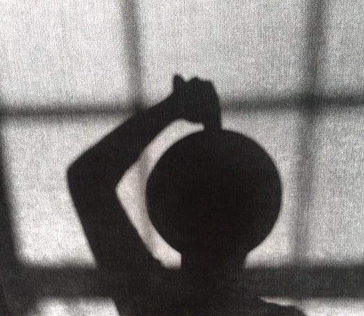
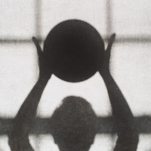
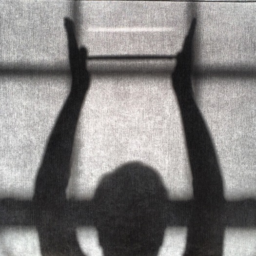
Task for this module was to compile a series of images produced in studio and/or location responding to fourĀ particular themes; one of these being Circles and Squares. Ā Using very simple cut card and my fellow students as models the images below were selected to work with.

The idea for the kaleidoscope effect evolved organically through another module in which Photoshop was being used and was appropriate to use in these pieces.Ā  The actual invention of came from Scottish scientist David Brewster in 1816.Ā  HeĀ named his inventionĀ “kaleidoscope” from the Greek words:

kalosĀ = beautifulĀ Ā Ā Ā Ā Ā Ā Ā Ā Ā Ā Ā Ā Ā Ā Ā Ā Ā Ā Ā Ā  eidos = formĀ Ā Ā Ā Ā Ā Ā Ā Ā Ā Ā Ā Ā Ā Ā  scopos = watcher

Therefore, kaleidoscopeĀ means “beautiful form watcher” which is pertinent to the patterns behind circles and squares formalism which is where I went next. Ā Creating a page of patterns using sections of the original images “kaleidoscoped”.

Report image 4


The initial images were then post processed in Photoshop using the pattern as background.

And there you have it, circles and squares.

A little extra one; to turn a square into a circle using the rotation of the square 49 times; once at 45 degrees, thrice at 22 degrees, then the remainder at 12.5 degrees.

square to circle

The perfect circle šŸ™‚


Unexpected Flower Part II

In this project it was important to move away from the traditional flower cliche. Ā Still using the flowers, water, vase Ā scenario I decided to blend the flowers in a nutri-bullet with some water, the ‘vase’ being a tea-cup, the results of which were ‘pretty’ but took it a step further and went for a more scientific aesthetic and used test tubes as the ‘vase’.

I printed these on acetate which enhanced the colour and was pertinent toĀ the whole scientific aesthetic..

Playing about on Photoshop I created a flower out of the test tubes then continued to develop some further images.

To end; not moving entirely away from the cliche I decided to use the remainder of the flowers in a more traditional way. Ā  Well sort of, took them to a small waterfall and held each oneĀ in place with some debris caught in the down flow and used a slow shutter speed to capture the water flow. Ā Printing these on Hahne Muller Fine Art Paper and being a little bit creative I soaked some paper in the remainder of the flower liquid, interleaving them with thin architect paper and the prints and had them wire bound into a book.

Voila, this was my studio and location flower project for the 2nd Semester Year 1.


Write your own brief – Professional Development

Update 31 March 2016

So… that important feedback time happened; Ā “Why don’t you play around with the font; size, colour etc for more impact”. Ā So I did and have to agree that playing around and changing the font has worked pretty well. Ā These are definitely an improvement on the originals, still adjustingĀ some of the others but I am glad of the suggestion.


28 March 2016

For our Professional Development Module we have all been tasked to write our own briefs for a project. Ā Having never viewed a client brief before the first stop was researching the internet for suitable templates in order to create my own version of a cohesive and professional set of objectives. Ā Consideration must be given to context, appropriateness of content, potential legal and ethical issues, location, technical specifications, target audience, time, aesthetic and background.

A subject close to my heart is mental health. Ā Having worked with and for a fantastically diverse range of human beings (and a couple of pat dogs) over the years I chose to base my project on the issues of stigma and the lack of knowledge/understanding towardsĀ individuals suffering fromĀ mental health problems. Ā My images are leaning towards students and the stresses of University, exams, social inclusion.

The objectives of my brief from a particular mental health organisation are outlined below.

  • The theme of these photographs are to convey the feelings of those suffering from a mental illness, particularly anxiety, in order to raise awareness and understanding for the benefit of parents, carers, friends and work colleagues.
  • We want to tackle the stigma young adults feel are associated with mental illness, in a sensitive, thought provoking and meaningful series of photographs that can capture the attention of both those suffering and those who care for/about them.
  • Appropriate use of text to make a short bold statement that captures attention to accompany the images.
  • They images would be used on our website, in student magazines, noticeboards and other appropriate vehicles that we consider suitable for advertising. Ā We are led by two other organisations, __________, _________ who may chose to work with the images.

By promoting these photos we would like to achieve:

  • We would like those viewing the photos to feel empathy, recognition and trigger thought and dialogue about the subject of mental health.
  • We would like to encourage visits to our website (http://www._______.org.uk) in order that they can seek further advice, address any concerns they may have and be made aware that there are good support networks out there to help.

I have used an organisation’s logo for my photographs for the purpose of reality but have purposefully blanked them out on here as I don’t want to be chased and beaten with the copyright stick, although I still maybe, as I have taken quotes from the internet as well as weaving in some words from memories, mine and others.

Below are some of the images that I have completed, some I am more pleased with than others.

I hope that I will not offend anyone with them and would like to think that I have completed my brief in a sensitive manner. Ā If you view them and are in any way offended then please let me know. Ā Please bear in mind that this is not a real brief and is done for the sole purpose of my University module.

Tiny Streetwise Revisited – Mary Ellen Mark

I recently bought this book by Mary Ellen Mark and have just watched the film Ā associated with the first project; Streetwise.

The project first started in 1983 when Mark was commissioned for an article in Life magazine which documented homeless and troubled youngsters working as pimps, prostitutes and drug dealers in Seattle. Ā Tiny (Erin) aged 13 years was a sex worker with dreams of “a horse farm, diamonds, furs and children”.

Tiny then became the main subject ofĀ Streetwise (1984), a film directed by Markā€™s husband Martin Bell. The film was nominated for an Academy Award in 1985. Ā Mark released the accompanying photo bookĀ Streetwise. Mark frequently visited Seattle over the next 30 yearsĀ continuing to photograph and interview her.

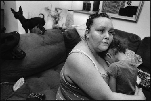
Tiny, Streetwise RevisitedĀ reveals these intimate portraits of Erin ā€œTinyā€ Blackwell and her 10 children along with conversations between Tiny, Mary Ellen Mark and Martin Bell. Ā It is a raw and compelling account of her descent into drug and alcohol addiction, her troubled relationship with her mother, shattered dreams and the difficulty in breaking out of that circle of social circumstance.

mary-ellen-mark-tiny-streetwise-revisited-body-image-1453176015-size_1000

The Business Card – Target Your Market

Update on Business Card project 30 March 2016.

So we all had a group critique on our cards that we had developed so far. Ā Mine were narrowed down to one (which I had done in a variety of colours) being deemed the most suitable. Ā Feedback; Ā “Why have you put Hello on them?” Ā I thought it looked good and I had seen them on other cards. Ā “It doesn’t really, looks too playful and you need to be taken seriously.”Ā  “Don’t like the font really either.” Ā OK! Ā It’s always good to have feedback though!

Following this I made a few revisions, including one with a QR code on which takes you directly to my website when you scan it on your phone, but I have also done a card without it as I think it may ruin the aesthetic and am not to sure if it’s really necessary.


February 2016

I have been designing some mock business cards for professional development project purposes. Ā I love this sort of thing anyway and I find the designing and research interesting. Ā There areĀ some great sites that produce card templates which you can either use for inspiration or just design your own from scratch; http://www.moo.com and http://www.banana-print.co.uk. Ā I have used both sites for the cards exampled below. Ā Designs range from the normal average size Ā card format to square, mini, round edge, square edge, postcards, there are many ways to let your creative wildness flourish, or just keep it simple if that’s what you like.

Some might say that business cards have had their day now that use ofĀ LinkedIn, social mediaĀ and smartphones are capable of networking and storing unlimited numbers of contacts. Ā Innovative and design savvy cards can still make you standout in a saturated market. Ā At the end of the day you want to represent what you do and your style all it takes is a glimpse of your “golden ticket”.

The most important information though is obviously your name, contact details, email/ web site and any other social media additions, then a myriad of other design aspects. Ā I think the next item on your design agenda should be the font you choose. Ā QR codes that lead straight to your website or sign up form when scanned seem to be quite popular but take up valuable space should your images be your priority, all depends how tech savvy you want to be.

Questions to think of;

Do I add a picture? Ā After all I am a photographer and want to promote my business, what image do I use? Ā Do I use more than one? Ā Moo Print Ltd let you select 5 designs for one side of your card so you could tailor your distribution towards the clients needs. Ā This would enable you to have a wider target audience particularly if you were quite diverse and not in a particularly niche market of photography. Ā Of course you don’t always have to have a picture, if you have a strong simple design this can be just as effective.

minicards.pdf

What paper? This couldĀ be the first contact you have with a client and that old adage of “first impressions count” would be appropriate to use. The client will be able to feel the paper’s texture so good qualityĀ paper is very important because Ā the last thing you want your business card to be is cheap and flimsy. Ā Also, the quality of printing will be greatly affected on the quality of the paper. Ā  If you are printing at home, you can use specialty papers thatĀ can also easily be cut with clean edges; you don’t want badly cut, wonky cards.

business_card-2-1

Size and shape? Ā As I mentioned above, cards come in various shapes and sizes; traditional, square, mini, postcard. Ā A different shape altogether is another way to add uniqueness to your design, customised into any shape you like, although thought should be given to the shape and how large or small your cards are. Ā  You don’t want them to get folded or bent out of shape, be so large they can’t be stored adequately or get lost in someone’s personal effects. Ā  Die-cuting is a cool way of individualising a card, an appropriately placed cut, particularly if you had a logo, looks great.

IMG_0005

Texture? Ā I love a bit of texture, if a card was given to me and it was touch sensitive then I would keep it. Ā Adding texture to your business card can make it look a lot more special. Ā If you can afford it splash out but it depends how much you want to spend as the price will go up that’s for sure . Ā If you are home printing you can keep the costs a bit lower as you can use textured papers, Ā or you could just have a picture of an image with good texture.

I may not go so far as to order 100’s of cards just yet!!! but I will have some fun designing and researching a variety of cards in the meantime until I come up with the ultimate card!

The Unexpected Flower

Another project on the go is one that involves using flowers, but of course for the purposes of being original and a bit ‘out there’ creatively it can’t be as simple as just flowers and needs to be an unexpected interpretation.

My thoughts are to still quite literally use flowers but along with re-appropriated images or posters of well known people, complete strangers or animals Ā and use an appropriate flower placed in an appropriate place (or in-appropriate without being offensive perhaps) and woven through the actual image, I would then photograph the completed image.

Re-appropriated; meaning borrowingĀ existing imagery or elements of imagery and re-contextualising orĀ appropriatingĀ the original imagery, allowing the viewer to renegotiate the meaning of the original in a different, more relevant, or more current context.

The use of re-appropriated images in art have been used for decades but some more contemporary approaches have been from the likes of Daniel Mayrit “You Haven’t Seen Their Faces” which uses images of reportedly the top 100 most powerful people in the City of London. Ā This book is in response to the London riots of 2011 and the Met Police distributing leaflets to houses containing CCTV images of “offenders” involved in the riots for identification, leaving recipients assuming they’re guilty because they have been captured on CCTV. Ā The people featured in this book represent a sector which could be “assumed”Ā as highly responsible for the current economic situation, who live in comfortable anonymity out of the public eye.Ā Ā The book addresses theĀ questions in the same way that we could not possibly know if the youngsters portrayed by the police were actually criminals, we cannot assume either that the individuals here featured are all involved in the ongoing financial scandals…but arenā€™t they? Click link below for details on the book. Ā Daniel Mayrit You Haven’t Seen Their Faces”

Danile Mayrit

Another excellent intelligence gathering and surveillance approach to documentary photography is that of Mishka Henner who uses Google Street View to produce a voyeuristic approach to landscapes, particularly in No Man’s Land which depicts roadside prostitutes in Italy and Spain.

Whilst the above images are freely available to re-appropriate, there are copyright issues in using other artists imagery. Ā Richard PrinceĀ is known for appropriating established works by other artists. Ā Regarding the legal implications of his work, Prince said in 2011, according to the complaint: ā€œCopyright has never interested me. For most of my life I owned half a stereo, so there was no point in suing me, but thatā€™s changed now and itā€™s interesting ā€¦ So, sometimes itā€™s better not to be successful and well-known and you can get away with much more. I knew what I was stealing 30 years ago but it didnā€™t matter because no one cared, no one was paying any attention.ā€ Ā 

Artists like Maurizio Anzeri and Julie Cockburn use embroidery and/or painted-on effects to alter ‘found’ photographs. Ā Using photographs of unknown individuals sourced from charity shops, house clearances, car boots sales etc. Ā These are much more along the lines that I am hoping to take some inspiration from.

I have looked into particular flowers and a few have cause to inspire me, the fantastic Psychotria Elata aka Hot Lips which is unfortunately not the easiest flower to obtain at this time of year but I shall persevere (thinking maybe a plastic surgery theme on this one). Ā It is interesting that all flowers also have a meaning and sentiment behind them; Ā a yellow carnation signifies disappointment, a striped one is a symbol of refusal, Geramium is stupidity or folly, Daisy is innocence and purity, these are just a few. Ā As my project progresses I will update my blog until then I will leave you with some hot lips!

hot lips

Place, memory, history, identity?

So this is for a current assignment based on the title really. Ā The brief is to create a book using a series of 12 (min) photographs in response to one of the following themes; Community, memory, place, history or identity. Ā I have a feeling that this project will cover much of these themes. Ā I decided to re-visit a small village in Kent that I spent much of my childhood in during the 70/80s. Ā It seemed appropriate to use my 35mm OM2 with Kodak Portra 160 colour film. Ā Definitely a case of familiar but strange all the same.

This slideshow requires JavaScript.


35mm film project

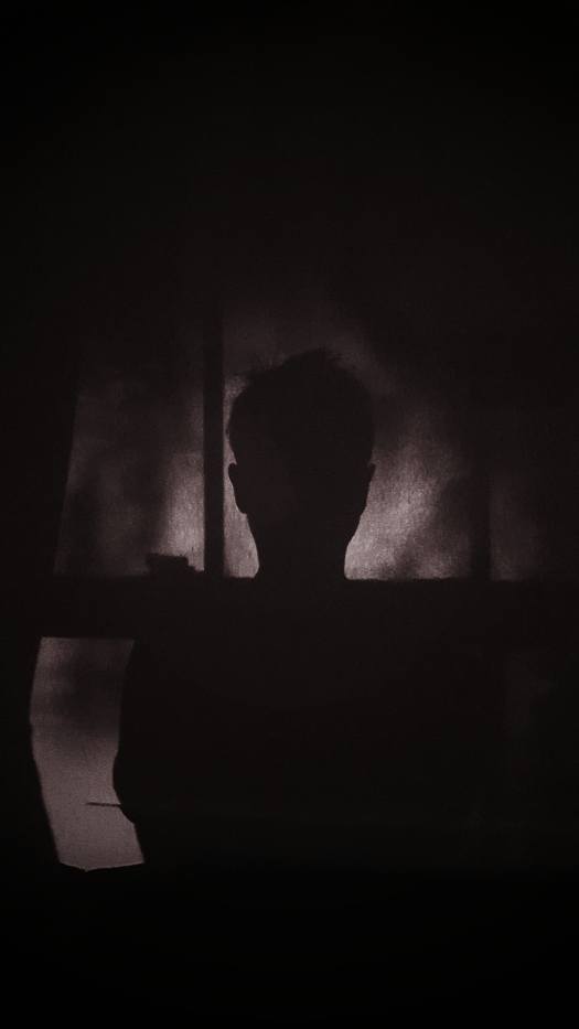
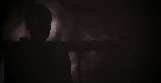
Blimey, never thought about using film again when starting University. Ā So had to go out and buy a 35mm camera and chose an Olympus OM2, which I absolutely love. Ā Produced a set of portraits in black and white (with an initially not very willing model!) at home Ā with my very simple, cheap studio set up. Ā After I developed and printed them in the dark room I scanned the negatives and made a tableaux form of images. Ā I am pleased with the results, so is my model I may add and will venture on to colour film for the next project.Landscape1Landscape2Landscape3Landscape4